| Author | Thread |
|
|
02/09/2003 11:01:49 PM |
Greetings from the Critique Club };-)
Initial thoughts
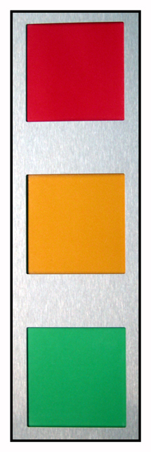
Unique take on the challenge, balance seems a bit off.
Composition/ Content
This was the very first shot I saw during the voting and I must admit I wasn't sure what to make of it. Well lit and colorful but rather uninspiring. The biggest problem I see is that the red square is a little off kilter. The others seem to be OK but that one has a left hand lean.
Background
The silver background is well lit and works well for the challenge.
Camera Work - Technical
Focus seems pretty good but I'm not sure exactly what I am looking at. If the lighting were moved to the side it may have made for a more dramatic shot with the textures in the metal coming out more and the shadows on the edge of the colors showing a more 3-D side as well.
Digital Processing - Technical
It seems a little grainy but once again, I'm not really sure what I'm dealing with here.
Fits The Challenge
Definitely fits the challenge well.
My Opinion On The Photo
I originally scored this shot a five as did most of the voters. I think that it meets the challenge but didn't really leap out at you and grab you. As I mentioned, even looking at it a lot for this critique, I'm still not quite sure what to make of it. Good job, and keep up the good work.
I would be happy to talk further about this shot if you would like to contact me.
DougPaz
|
|
 Photographer found comment helpful. Photographer found comment helpful. |
Comments Made During the Challenge  |
|
|
01/30/2003 10:57:59 PM |
| It is straight at the bottom, but not at the top. That makes it feel kinda off balanced to me. maybe a different perspective that showed the same thing would have made the picture more dynamic. |
|
| Photographer found comment helpful. |
|
|
01/30/2003 02:19:51 PM |
| Good colors, but not very original. |
|
| Photographer found comment helpful. |
|
|
01/29/2003 08:29:21 PM |
| A photo of a wall hanging? Not a lot of originality. Nice colors, though. |
|
| Photographer found comment helpful. |
|
|
01/29/2003 12:37:05 PM |
| Nice! The colors are so vivid and appealing! Your borders really work well for these colors and shapes. I really like the simplicity of this. |
|
| Photographer found comment helpful. |
|
|
01/28/2003 01:23:54 PM |
|
| Photographer found comment helpful. |
|
|
01/27/2003 01:42:48 PM |
| I am an admirer of good verticals. This works for me, and fits the challenge well. Jak 7 |
|
| Photographer found comment helpful. |
Home -
Challenges -
Community -
League -
Photos -
Cameras -
Lenses -
Learn -
Help -
Terms of Use -
Privacy -
Top ^
DPChallenge, and website content and design, Copyright © 2001-2025 Challenging Technologies, LLC.
All digital photo copyrights belong to the photographers and may not be used without permission.
Current Server Time: 03/13/2025 02:02:11 AM EDT.