| Author | Thread |
Comments Made During the Challenge  |
|
|
11/02/2004 11:03:31 AM |
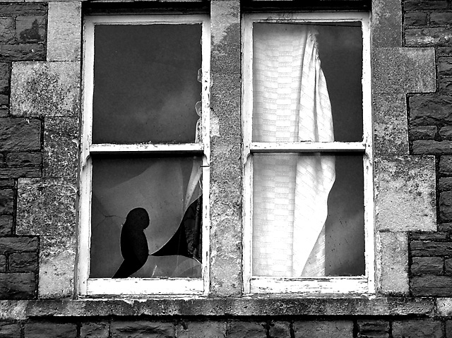
| Great textural contrast. Maybe a little tighter crop at the top? |
|
 Photographer found comment helpful. Photographer found comment helpful. |
|
|
11/01/2004 08:25:29 PM |
| you coul have got better lighting with color,but its worth a 7. |
|
| Photographer found comment helpful. |
|
|
10/31/2004 04:26:51 PM |
| this is way more than neglected. Like the textures. |
|
| Photographer found comment helpful. |
|
|
10/29/2004 01:06:54 PM |
| house seem abandoned more than impoverished would be my biggest complaint. I do however like the contrasts, and overall balance. |
|
| Photographer found comment helpful. |
|
|
10/28/2004 03:40:28 AM |
| this is a real dilapidated window and gives the feeling of an age of neglect, iy=it is an effective image of that, one can only surmise of the types of poverty that has caused this, I would have liked to have seen it not cropped so hard on the top |
|
| Photographer found comment helpful. |
|
|
10/27/2004 01:12:02 AM |
| i would have liked to see the bottom and top of the window frame i think you framed it poorly |
|
| Photographer found comment helpful. |
Home -
Challenges -
Community -
League -
Photos -
Cameras -
Lenses -
Learn -
Help -
Terms of Use -
Privacy -
Top ^
DPChallenge, and website content and design, Copyright © 2001-2025 Challenging Technologies, LLC.
All digital photo copyrights belong to the photographers and may not be used without permission.
Current Server Time: 03/14/2025 09:26:29 AM EDT.