| Author | Thread |
|
|
11/08/2004 10:08:07 AM |
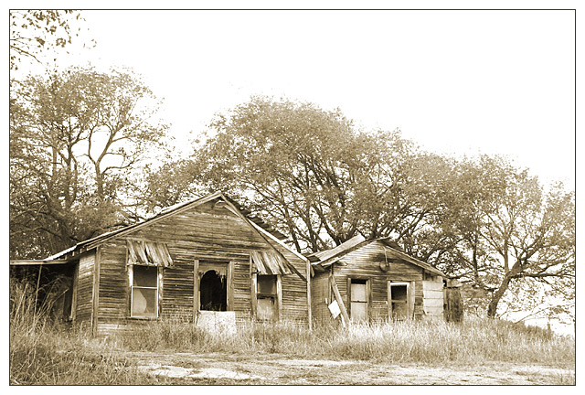
| I think that in this case it would have benefited you more to have a person model in shabby clothes, preferably a child, standing in the doorway. Someone who innocently doesn't know any different between their life and yours. I think the monotone works, but maybe something with higher contrast. Just a thought. |
|
 Photographer found comment helpful. Photographer found comment helpful. |
Comments Made During the Challenge  |
|
|
11/02/2004 07:22:29 PM |
| I like your idea and composition, but the sepia just isn't working for me. It seems a little blown out which makes it lose some of the details |
|
| Photographer found comment helpful. |
|
|
11/02/2004 10:44:34 AM |
| Nice washed-out tone the photo. |
|
| Photographer found comment helpful. |
|
|
11/02/2004 02:47:48 AM |
| this looks like a very old photo, i like the feel of it.these houses make me wonder about the stories they hold. |
|
| Photographer found comment helpful. |
|
|
10/31/2004 03:30:15 PM |
| almost fades away. Would like more contrast and definition. The black gaping door helps - but more of that would help. |
|
|
|
10/30/2004 07:33:47 PM |
| I think this would have had more impact if the entire image was darker |
|
| Photographer found comment helpful. |
|
|
10/29/2004 11:39:40 AM |
| Maybe I would have liked with more contrast, but nice anyway |
|
| Photographer found comment helpful. |
|
|
10/29/2004 06:31:16 AM |
| I like the high key approach, perhaps I may have balanced it with more foreground. 5 |
|
| Photographer found comment helpful. |
|
|
10/29/2004 06:02:56 AM |
| There seems to be a confusion between Poverty and decay in this challenge, although related they are not the same.This is a great image and I like the presentation of it but for me it doesnt say poverty,.however I have taken a broad view of the subject and rated it reasonably high {for me} |
|
| Photographer found comment helpful. |
|
|
10/29/2004 02:41:07 AM |
| This is great picture of some old buildings. What would make the connection even stronger to the challenge would be some evidence that there are people living here. Clothes on a clothes line, a person in the doorway, etc. |
|
| Photographer found comment helpful. |
|
|
10/28/2004 07:13:11 PM |
| Has a great vintage or historical feel to it; excellent challenge entry. Good eye for composition within the frame, also. |
|
| Photographer found comment helpful. |
|
|
10/28/2004 02:22:28 PM |
| Great catch, bumping up to a 9. |
|
| Photographer found comment helpful. |
|
|
10/27/2004 08:21:43 PM |
| like this a lot.....wish it looked like someone lives there...8 |
|
| Photographer found comment helpful. |
|
|
10/27/2004 02:53:58 PM |
|
| Photographer found comment helpful. |
|
|
10/27/2004 12:02:54 PM |
| Good picture. Maybe it needs to be darker? |
|
| Photographer found comment helpful. |
|
|
10/27/2004 10:18:42 AM |
|
| Photographer found comment helpful. |
|
|
10/27/2004 08:33:51 AM |
| Excellent shot, one of the best in the challenge IMO. If you ever get the opportunity to reshoot this, I think it would probably look great at night with startrails above it. |
|
| Photographer found comment helpful. |
|
|
10/27/2004 06:27:52 AM |
|
| Photographer found comment helpful. |
|
|
10/27/2004 01:41:27 AM |
| the sky is just a tadd over ex. for my tast but i like the shot very much |
|
| Photographer found comment helpful. |
|
|
10/27/2004 01:29:58 AM |
| I like the over-exposed look to this picture. Reminds me of an old sepia photo that has faded over the years. |
|
| Photographer found comment helpful. |
|
|
10/27/2004 12:16:41 AM |
| It looks over exposed, but was that intentional? 7 |
|
| Photographer found comment helpful. |
Home -
Challenges -
Community -
League -
Photos -
Cameras -
Lenses -
Learn -
Help -
Terms of Use -
Privacy -
Top ^
DPChallenge, and website content and design, Copyright © 2001-2025 Challenging Technologies, LLC.
All digital photo copyrights belong to the photographers and may not be used without permission.
Current Server Time: 03/12/2025 02:33:10 PM EDT.