| Author | Thread |
|
|
02/06/2003 07:53:49 PM |
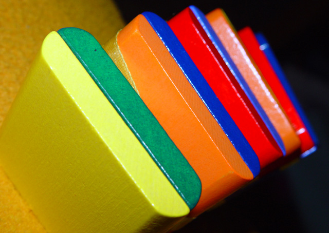
| I just read what the others had to say and I better bite my lip. Your point of view is very creative, the colors are the most vivid I have seen in the challenges I've critiqued, and you were spot on with the challenge. I really like the perspective and the way it curves, but I won't steal your idea for this weeks challenge. I swear when someone has a pic that is doing poorly they cut down everyone elses. This is definitely a 7/8 pic. Now for my two cents worth. When I have an image that covers the whole picture I like to add something that will break up the flow so my eye will not flow off the page. As you can tell your eye flows from the front to the back of the blocks and there is nothing to stop your eye or to keep it from going off the page. Maybe a Lego person at the next to last square. Just trying to visualize. Set up your picture again and see if what I suggested looks better? Keep up the good work!John Gill |
|
Comments Made During the Challenge  |
|
|
02/01/2003 02:14:28 PM |
| This is just my personal opinion but I don't like the angle of the camera when taking this photo. Also there is only one square and you cropped it off. In our mind we know all the colors are squares but we don't see it. The angle makes me feel like I'm falling as I look at the photo. Personally this has no appeal. |
|
|
|
02/01/2003 05:42:09 AM |
Composition: Excellent. As soon as I saw this pic I turned my head 45 degrees to try and work out what they are.
Technical: Excellent. Not completely sure about the orange background. Maybe a darker colour?
Meets challenge: Yes
Overall impression: I love interesting photos, and you've got this one pretty spot on. 9 |
|
 Photographer found comment helpful. Photographer found comment helpful. |
|
|
01/30/2003 02:25:38 PM |
| Nice photograph, but the objects in this picture look more like rectangels than squares. |
|
|
|
01/30/2003 01:48:13 PM |
| I looked at this shot for a few minutes and I hate to say it but I do not think it does very much for me. |
|
|
|
01/29/2003 05:34:50 PM |
| Shows part of a square, but... |
|
|
|
01/29/2003 03:20:03 PM |
| I like the colours, and the depth of field is just right, it's the lack of squareness that bothers me. Perhaps a different angle would have helped. |
|
|
|
01/29/2003 02:40:48 PM |
| I think you did a very nice job on this picture I think how you have the brightest color upfront and then they keep getting less bright as you get to the end. i think that the picture needs to be a little more in focus. Good Work |
|
| Photographer found comment helpful. |
|
|
01/29/2003 04:18:48 AM |
| interesting idea for a composition, color progression is a little harsh. I would try for that one (if you use photoshop) to pull up the hue to +40 OR to decrease the saturation to -45 to get a smoother color progression. hope this helps. |
|
| Photographer found comment helpful. |
|
|
01/28/2003 12:03:24 AM |
| My little brother has one of these, I never would have thought of this, great idea! Like the vibrant colors, like dof, not crazy about the background though. I think an all black background would have been great for this. |
|
| Photographer found comment helpful. |