| Author | Thread |
|
|
02/07/2003 11:18:17 AM |
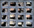
| Very effective use of space, shadow, color, shape, and lighting. The simplicity of the image and yet it's powerful striking visual effect work great together. Excellent composition. I find it interesting that you would use an abstract image as an idea for a photograph. Especially one that is reasonable flat. A photograph by nature is two dimensional, highth and width. By photographing something that is flat this does not change the nature of the picture. If this was done on purpose, I would be interested in knowing why. Otherwise I would try and make it look more three dimensional to give it depth. None the less, this pic is very dynamic and worthy of a much higher score than 6.03. Keep up the creative thinking and good luck in future challenges. John Gill |
|
Comments Made During the Challenge  |
|
|
02/02/2003 04:28:50 PM |
| Don't think I can say it the same twice and it didn't take the first time. Strange and uniquely done. Nothing makes sense to me: the cropping; the placement of the red; the placement of the wooden frames. Did you use shadows? Put it all together and it's a nice piece of modern art. Very thought provoking and well done. I hope you explain how you did this. Very different and well done photo. |
|
 Photographer found comment helpful. Photographer found comment helpful. |
|
|
02/02/2003 01:53:57 AM |
| Nice creative concept and good composition. The bright light reflections on the left are a bit distracting. |
|
| Photographer found comment helpful. |
|
|
02/01/2003 10:01:32 PM |
| Nice composition, lighting, and exposure. My favorite. |
|
| Photographer found comment helpful. |
|
|
01/30/2003 11:35:39 PM |
| I normally don't care for abstracts, but yours is an exception. This is a wonderful combination of contrasting colors, and it is a very effective use of negative space I think. |
|
| Photographer found comment helpful. |
|
|
01/30/2003 10:43:36 PM |
| Great concept! I really like your lighting and color. Placement is good as well. Cold be just a wee bit sharper, probably would have benefited from a larger file size allowed by the rules. Great job. |
|
| Photographer found comment helpful. |
|
|
01/29/2003 08:55:51 PM |
I'm trying to picture how this would have looked if you'd turned one of the trays so that the red was on the left. Not a criticism, mind you, I really like this picture. I just think it might have been an interesting variation.
The off-centre placement works very well. |
|
| Photographer found comment helpful. |
|
|
01/29/2003 08:45:09 PM |
| I like the cropping. The lighting is nice. I like the contrasting colors of the laquerware. |
|
| Photographer found comment helpful. |
|
|
01/29/2003 11:34:15 AM |
| this is a great abstract..Ilike the bold colors against the blck background..composition is good. |
|
| Photographer found comment helpful. |
|
|
01/29/2003 10:43:38 AM |
| i really like the lighting |
|
| Photographer found comment helpful. |
|
|
01/28/2003 10:11:36 PM |
| you get extra points for using an anarchist color scheme. |
|
| Photographer found comment helpful. |
|
|
01/28/2003 02:35:35 PM |
| Very good. I think the contrast with the colors matches the abstrat feeling you get while looking at the photo. |
|
| Photographer found comment helpful. |
|
|
01/28/2003 12:26:41 PM |
| Nice idea- composition and color, light is too harsh for me. |
|
| Photographer found comment helpful. |
|
|
01/28/2003 02:23:37 AM |
| I like this one! Very creative, and nice lighting! |
|
| Photographer found comment helpful. |
|
|
01/27/2003 11:31:17 PM |
|
| Photographer found comment helpful. |
|
|
01/27/2003 09:02:28 PM |
|
| Photographer found comment helpful. |
|
|
01/27/2003 03:16:20 PM |
| The shadow adds beautifully to the "square" theme. Nicely balanced composition. Congratulations with this beautiful photo! |
|
| Photographer found comment helpful. |
|
|
01/27/2003 01:44:42 PM |
You have a modern art masterpiece here! This is my number one pick for this week. I love the composition and the use of lighting. I wonder how you got such sharp shadows in this one. I love the interaction of the colors and the texture of the boxes. I can�t think of a single thing I would change about it. Very well done!
Greg
|
|
| Photographer found comment helpful. |
|
|
01/27/2003 10:42:45 AM |
| Interesting shot. I'm not sure I like the positioning. I think a little larger would have been better.. Cub |
|
| Photographer found comment helpful. |
|
|
01/27/2003 05:32:50 AM |
| I'm not sure about the composition. The placement of the squares just doesnt feel right. |
|
| Photographer found comment helpful. |
|
|
01/27/2003 03:07:25 AM |
| very nice. simple. subtle. 9 |
|
| Photographer found comment helpful. |
Home -
Challenges -
Community -
League -
Photos -
Cameras -
Lenses -
Learn -
Help -
Terms of Use -
Privacy -
Top ^
DPChallenge, and website content and design, Copyright © 2001-2025 Challenging Technologies, LLC.
All digital photo copyrights belong to the photographers and may not be used without permission.
Current Server Time: 03/12/2025 08:08:12 PM EDT.