| Author | Thread |
|
|
02/09/2003 07:23:53 PM |
Critique Club Critique
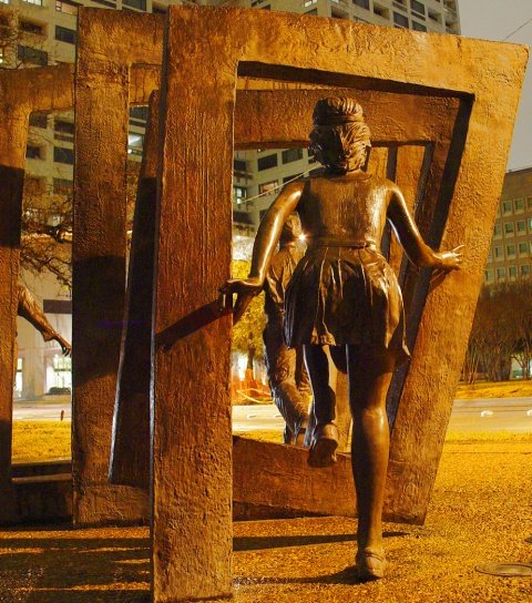
Composition/Content: Interesting image. You've had some really good comments on how to improve this. The different sources of light create a background that is a different color than the foreground and that takes away from the impact of the image. Being a picture of someone else's artwork also takes away points. The camera angle hides the other figures jumping through the squares.
Camera Work/Technical: You've really done a good job with the focus, exposure, and the night shot.
My Opinion: I think that being mostly a picture of another's artwork, having a distracting background, and the main subject not really a square contributed to this image's final score in the challenge. Even so, I think it is a very interesting shot and would like to have seen it from the front of the figures. |
|
Comments Made During the Challenge  |
|
|
01/31/2003 01:57:08 PM |
| The subject of this photo is very nice. The colors really catch your eye. |
|
|
|
01/30/2003 04:17:08 PM |
| This is a very cool photo! Where did you take it?? The color in the photo is very nice. . .it really grasps the attention of the eye. Cool idea! |
|
|
|
01/30/2003 03:20:26 PM |
Composition: Good
Technical: Good colour/focus/lighting
Meets challenge: Pushing it a bit! :-)
Overall impression: Really nice pic that I would hang on my wall. 8 |
|
|
|
01/29/2003 11:48:08 PM |
| You've set yourself a doubly difficult task here; night photography and OPA (other people's art). As to the first, it's not bad. I'm not wild about the shadows produces by what looks like sodium vapor lighting on the statue, but given the mixed lighitng your colors aren't too far off and the camera was held still enough for a clear image. My personal feeling about OPA, though, is that a photograph of someone else's work really needs to add something to the original to be worthwhile. I just can't see that you've accomplished that here. This is a perspective available to anyone wallking by this sculpture (why from the back, anyway?). From above, or below, or some other unique perspective is the only way (IMO) to make something like this work. |
|
|
|
01/29/2003 08:44:20 PM |
| Very interesting sculpture. Great colors. Wonderful lighting!! But not a square - they're rectangles. |
|
|
|
01/28/2003 06:18:08 AM |
| it is of good rythm and the warm with great force to jump through the windows |
|
|
|
01/27/2003 05:09:05 PM |
| Nice angle of view and good choice of subject but I would have liked to see less depth of field. IMO this way the background is too distracting. It seems the area is floodlit by a large lamppost - the picture would have come out better at night I think, or during the day when it's turned off. Keep going! |
|
|
|
01/27/2003 03:17:03 PM |
| it looks like a rectabgle to me? |
|
|
|
01/27/2003 04:42:06 AM |
| The composition seems to straight a different angle may have been more Intriguing |
|
|
|
01/27/2003 03:05:04 AM |
| Very nice. Well composed. But, why the butts? why not the fronts. nice gold tone. |
|
Home -
Challenges -
Community -
League -
Photos -
Cameras -
Lenses -
Learn -
Help -
Terms of Use -
Privacy -
Top ^
DPChallenge, and website content and design, Copyright © 2001-2025 Challenging Technologies, LLC.
All digital photo copyrights belong to the photographers and may not be used without permission.
Current Server Time: 03/12/2025 07:55:59 PM EDT.