| Author | Thread |
|
|
02/16/2003 09:13:26 PM |
OK. This is one of those shots that I'd like an explanation for. Exactly what were you thinking when you submitted this? I wanna know what it is that made you take the picture and why you chose it to submit. If you want to continue submitting shots then please take this as a learning experience.
The challenge was to pick a topic that is photographed way too much (kids, pets, flowers) and take your best shot of it. IMO, this shot doesn't meet the challenge. That alone will drop your score quite a bit. Secondly, I can't really see that much thought went into the shot. It seems like you just pointed the camera and shot. The trees are in the way of the house, but the house isn't very interesting a subject to begin with. There's really not much to look at in this photo. You've also cropped it way too close on the sides and bottom.
The focus is also soft - maybe it was too dark to be taking a picture without a tripod and you shook it some - and the it seems dark and underexposed.
Overall, I think this picture just doesn't have much going for it and probably deserved the score it got. |
|
Comments Made During the Challenge  |
|
|
02/09/2003 10:40:48 PM |
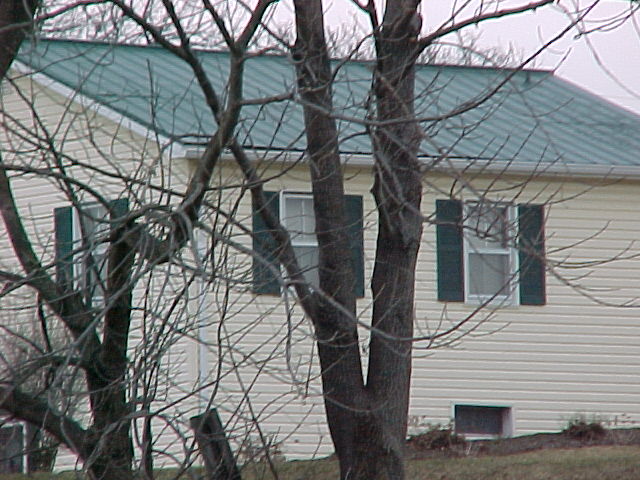
| should not be cropped on both sides. one or the other would have worked nicely |
|
|
|
02/09/2003 08:42:48 PM |
|
|
|
02/09/2003 05:27:04 PM |
|
|
|
02/08/2003 12:49:46 PM |
| The picture is not in focus. jgillard5 |
|
|
|
02/07/2003 09:07:54 AM |
| Didn't I see this house before, or one just like it? This is not an interesting house or shot, but I like it. The reason I like it is ridiculous. I like it shot through the tree like this. I love the tin roof. Nice job of keeping the horizon level. Looks like a dreary day. Nice photo. |
|
|
|
02/06/2003 11:19:19 PM |
|
|
|
02/06/2003 09:25:15 PM |
| Soft focus, not great framing. I don't really know what I'm supposed to be looking at .. the trees or the house. |
|
|
|
02/06/2003 11:47:24 AM |
| The subject is too obscured. Picture is out of focus. |
|
|
|
02/05/2003 04:45:35 AM |
| Awefull, it's out of focus and the trees ruin the shot as well. |
|
|
|
02/04/2003 12:14:17 PM |
| This photo looks a little flat to me. I hope you don't mind but I took it into photoshop and adjusted levels and did unsharp mask and I think it looks better. You can see it at www.pbase.com/rcrawford/dpc if you are interested. Good Luck |
|
|
|
02/04/2003 04:12:40 AM |
| A visually compelling portrayal of a middle class winter dwelling. The color tones are well chosen but I think the tree should cut more evenly between the two windoes. The slant of the lines on the roof goes real nice witrh the ones on the house and shutter. I dont like the sign pose or whatever it is between the trees in the front. I would take 2 to 3 steps closer and center the attention on the small window. |
|
|
|
02/03/2003 02:31:10 PM |
| nice job! i like the way the color all works together in this image! |
|
|
|
02/03/2003 10:28:47 AM |
| Very confusing and out of focus picture. |
|
Home -
Challenges -
Community -
League -
Photos -
Cameras -
Lenses -
Learn -
Help -
Terms of Use -
Privacy -
Top ^
DPChallenge, and website content and design, Copyright © 2001-2025 Challenging Technologies, LLC.
All digital photo copyrights belong to the photographers and may not be used without permission.
Current Server Time: 03/13/2025 01:26:11 AM EDT.