| Author | Thread |
|
|
04/20/2005 05:53:09 PM |
| This is a wonderfull composition! Its a great image.. A couple of things looks like already mentioned for improving... ya know perfections in photogs.. :) Really cool though!! |
|
 Photographer found comment helpful. Photographer found comment helpful. |
|
|
11/19/2004 05:33:41 AM |
Greetings from the critique club!
A few of the things I�ve noticed have already been commented on, but I�ll still mention them along with what I feel are acceptable solutions to the issues.
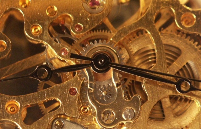
The first thing I noticed was the softness of the clocks inner workings. The intricate golden metal screams for sharp detail and while I can see some of that detail, it isn�t quite as sharp as it deserves to be in my opinion. This appears to be caused by a fairly shallow depth of field (DOF) which keeps the hands sharp, but drops off from there. While a shallow DOF works in some situations, it seems a bit distracting with this particular subject. I�m not sure what your f-stop was set to, but by opening it up a bit more (larger number) and adding a bit more light you would create a deeper DOF and easily get the whole image in focus.
Another thing that I noticed (which could also effect the sharpness), is the lack of contrast in the golden inner workings. I see light and medium tones, but nothing that gives this image a nice dark contrast to the lighter tones. By stopping down as mentioned above and moving the light a bit further left, you could increase the contrast on the edges and within the inner workings. It looks like you might have had a reflector or fill light filling in the shadows; you could decrease this a bit as well. I guess experimentation would tell if my suggestions are pertinent to your image or not.
One more thing that noticed right away was the fact that the tip of the minute & second hand were cut off. It�s an unwritten rule that most clocks or watches be set at 10:10, I have no idea why, but this would have helped keep all of your hands in the image while keeping it fairly well balanced. For some examples of what I�m talking about, check out ROLEX and TIMEX for examples.
I have to say that I really like the fact that you centered the subject, normally people would try to mess around with the �rule of thirds�, but I�m glad you didn�t. Overall, with a few minor adjustments, this could easily be ribbon material, nice work!
I hope this helps,
Quadrajet
|
|
| Photographer found comment helpful. |
Comments Made During the Challenge  |
|
|
11/15/2004 06:39:31 PM |
|
| Photographer found comment helpful. |
|
|
11/13/2004 04:22:21 PM |
It's not your fault, but I'm getting tired of inside views of clocks. Don't worry, I took a shot of a wristwatch. Just like ten other people.
You shouldn't have cropped the pointers, and the upper right corner is motion blurred. |
|
| Photographer found comment helpful. |
|
|
11/13/2004 12:36:54 AM |
| For me this would be better with a bit more DOF |
|
| Photographer found comment helpful. |
|
|
11/12/2004 05:12:47 PM |
| Most creative clock/watch in the bunch. |
|
| Photographer found comment helpful. |
|
|
11/12/2004 07:06:40 AM |
| Some contrast would help this image 'pop' more, and also USM would stop it looking too soft as it does now. |
|
| Photographer found comment helpful. |
|
|
11/12/2004 06:36:36 AM |
| Nice warm lighting - empasizes the fact that this is a shot of inner workings. Detailed mechanism is often quite fetching if all in focus, but you have made a good coice of the hands as centre for your DOF. |
|
| Photographer found comment helpful. |
|
|
11/10/2004 12:36:13 AM |
| Very cool watch, but the DOF and lighting is not good enogh to present what the watch is worth... |
|
| Photographer found comment helpful. |
Home -
Challenges -
Community -
League -
Photos -
Cameras -
Lenses -
Learn -
Help -
Terms of Use -
Privacy -
Top ^
DPChallenge, and website content and design, Copyright © 2001-2025 Challenging Technologies, LLC.
All digital photo copyrights belong to the photographers and may not be used without permission.
Current Server Time: 03/13/2025 02:51:22 AM EDT.