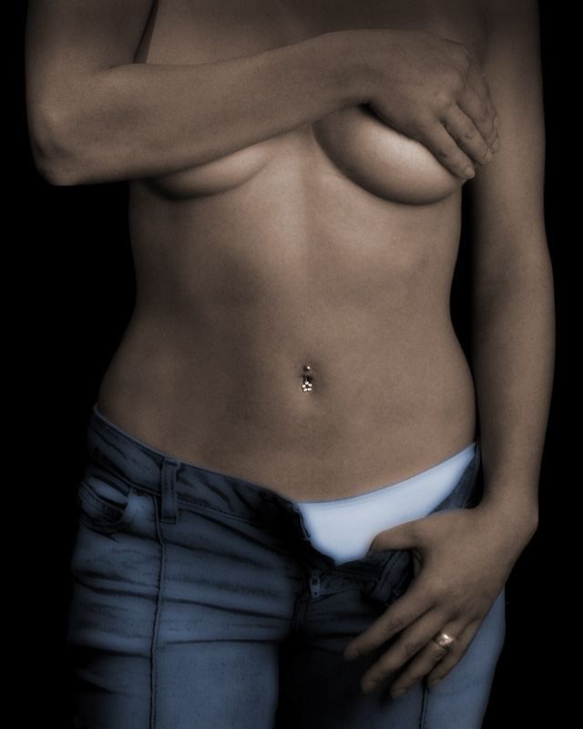
I really like this image. The picture has a somewhat sculpted feel to it which is very interesting. I think the pants and underwear look somewhat like they are painted in, but I go back and forth about whether I like that particular aspect. As I have the most qustion about the underwear it seems to me that the easy fix (if you were inclined to fix which by no means do I suggest I am right on this) it to just take the photo and not have her wear the underwear - leave all other elements the same. That way the glow of the white does not stand out and distract from what I consider a wonderful shot.
On a side note, clearly people are drawn to your images because I was blown away by the number of views you received for this and your other image from Tuesday in a very short period of time. Keep up the great work.
The effect is interesting and artistic as it stands, however at first pass, her skin is mottled with noise and greenish tints (at least on my monitor and I have finally calibrated it). I would think if this is a portfolio shot, that it would be unacceptable as the coloration I noted makes me think that she is somehow ill or not 'perfect' like a model is 'supposed' to be.
I like the balance of the shot. Highlight on the breast, belly and finger: one in each third. Arms/Shoulders wide, the waist is pinched in the very center drawing the eye to the jewel in the belly and the jeans start in the bottom third and expand with the hips, also balancing the shot.
I have to agree with the cover hand comment tho. Something about the angle is making it look way too male, her fingers should terminate at the edge of the breast so that the facing is mostly across the front, her hand can wrap to the center. That would show off the length and narrowness of her digits, much better.
I would say the most distracting is the skin tone. If you can make it more naturally-colored, while softening it, I think it would make a much better portfolio shot for a model...
Going out on a limb here, why is the 'wedding ring' so thick? This is a fashion that I would expect to see on a man as well, a thinner ring is typically the choice on a woman. It lends to an illusion that (dare I say it at the risk of offending?) that this is a workup in photoshop of someone who may not be all that we are truely seeing, or perhaps, much more than we realize we are seeing. (I'm quite sure that this woman is very attractive and that a non-artistic version of this shot would be flattering and stunning, but as it is the art that has been applied (along with the lack of head/face) poses too many questions that call the model herself into question.
I like the effect on the pants and panties, but definitely not on the skin. Also, the hand that is covering the breast looks strange, i get an impression that that is a man's hand... although that doesn't quite compute, hence the disbalance. Probably because of the viewpoint and resulting short fingers.
The ring on the finger is too distracting as well, and it doesn't quite fit into the whole image either...
And i don't like the composition. As it is, the belly button is the center of the conmposition, and it's all symmetrical... Neither should be the case, imo.
You know, photograph is more reproducing something the same as it was...
I have try to make this one unique, quite different from the original picture
far from a Picasso, but the effect seem just ok to me, not too far not too realistic...
I think the pic is very nice and the effect is cool too, but if you're going to give her that for an actual portfolio, I haven't seen too many modeling agencies that use or want that kind of artistic look in the photos that they review. ( My friend's sister used to work at an agency for years so she was always showing us the portfolios of wannabe models).
I think it is an ok shot, THe softishness of it and the tonal range arec good my only niggle is the white area of underwear is a little jarring for me perhaps she could have worn something a little darker or dipensed with it altogether. my 2c if it helps.