| Author | Thread |
|
|
02/14/2003 05:41:15 AM |
Greetings from the Critique Club
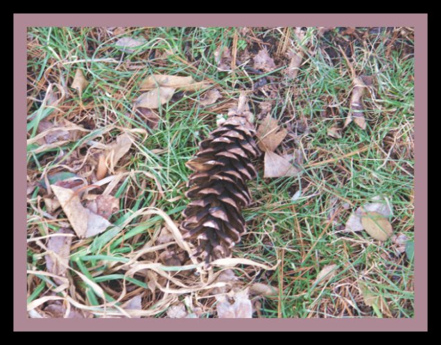
Composition: There are too many things the same colour in this image and that includes the border.
Technical: focus is good.
Meets challenge: Not quite sure why this is cliche.
Overall impression: A Busy picture that doesn't draw the eye to any particular point and allow it to come to rest.
Suggestions
Get rid of the border! Crop the image until the pine cone is in the bottom left corner, increase the contrast. |
|
Comments Made During the Challenge  |
|
|
02/09/2003 11:53:10 PM |
| No clear subject, no snap in colors, cluttered. I have the same problems. I am trying to concentrate on the surrounding "stuff" and remove everything that does not support the subject. |
|
|
|
02/09/2003 12:54:06 PM |
| seem over exposed... try adjusting the brightness/contrast settings in photoshop or whichever program you use.. a tighter crop would be nice as well |
|
|
|
02/09/2003 10:38:16 AM |
| Too centered. The background is too busy. The frame doesn't compliment the picture very well. Not focused very well either. |
|
|
|
02/07/2003 12:46:23 AM |
| The light brown border being so close to the color of the pine cone makes it a little hard to see the pint cone. It draws your eye out so that you see the whole photo as a unit rather than being able to look at the pine cone. The brown leaves add to this affect. I truly believe the border really hurt you this time. The black one alone would have forced your eyes inward toward the center. Don't get me wrong. It is a well focused photogaph, nicely done. But the border prevents you from seeing this, and acutally makes it look like just almost a messy piece of grass. It actually takes this from a 9 to a 4. |
|
 Photographer found comment helpful. Photographer found comment helpful. |
|
|
02/06/2003 10:38:09 AM |
| The subject blends into the background too much. |
|
|
|
02/05/2003 04:47:59 PM |
| Not very interesting and the focus and color isn't so good. Try using Unsharp mask and play with the exposure settings on your camera. Use auto-levels to see if that helps the colors. |
|
| Photographer found comment helpful. |
|
|
02/05/2003 02:02:49 PM |
| I think that I see what you are trying to achieve here and can appreciate feel of the image. However, the centered subject makes for a rather static photo. That is, there is no visual motion. Nothing to lead the eye around, to or from the subject. |
|
|
|
02/05/2003 12:16:54 PM |
| It would have improved the image if you had first removed all of the dead leaves, then framed the pic so that the pine cone is off center. Not very interesting as is. |
|
| Photographer found comment helpful. |
|
|
02/04/2003 08:19:10 PM |
| How is this a cliche? Poor coloring... |
|
|
|
02/04/2003 12:58:09 PM |
| this could have used a bit of unsharp mask applied to it. |
|
| Photographer found comment helpful. |
|
|
02/03/2003 07:50:54 PM |
| I'm not really understanding how it's a cliche. |
|
|
|
02/03/2003 02:50:32 PM |
| perhaps off centering the pine cone would create more interest. nice concept! |
|
|
|
02/03/2003 02:24:33 PM |
| Good picture, very creative.I think if the picture was closer you would have a better feel. |
|
|
|
02/03/2003 02:08:06 PM |
Composition: Subject may perhaps have been better off-centre
Technical: Good focus. Pic seems a little busy due to the leaves. The actual subject of the pic isn't instantly obvious. Border is bold and suits the pic.
Meets challenge: Not quite sure what cliche you're trying to depict.
Overall impression: Busy pics aren't bad, but the subject(s) need to be identifiable I think. 5 |
|
| Photographer found comment helpful. |
Home -
Challenges -
Community -
League -
Photos -
Cameras -
Lenses -
Learn -
Help -
Terms of Use -
Privacy -
Top ^
DPChallenge, and website content and design, Copyright © 2001-2025 Challenging Technologies, LLC.
All digital photo copyrights belong to the photographers and may not be used without permission.
Current Server Time: 03/13/2025 06:21:56 AM EDT.