| Author | Thread |
|
|
03/01/2017 04:43:41 AM |
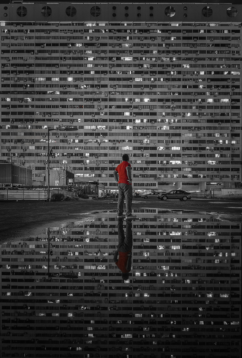
| Very well done. Like others, I am not a fan of the selective color. In this instance, though, it works better than most. Matrix is a perfect title for this image, too. |
|
Comments Made During the Challenge  |
|
|
02/21/2017 11:30:14 PM |
| Beautifully made. The red top makes it pop. I love how straight and square the geometry is. Top few. |
|
 Photographer found comment helpful. Photographer found comment helpful. |
|
|
02/21/2017 04:24:16 PM |
| I like the photo but the selective desaturation doesn't really work for me here. |
|
| Photographer found comment helpful. |
|
|
02/21/2017 11:45:41 AM |
| I am usually not a fan of selective color images, however this one seems perfect. Love the composition. (voted earlier) |
|
| Photographer found comment helpful. |
|
|
02/21/2017 10:55:30 AM |
| Not a fan of the selective color and it's a little flat from a contrast standpoint. Fans at the top are distracting so you'd better served to crop at least down if not in. Otherwise nicely seen and executed. Maybe instead of the selective color next time, shoot one with and one without and remove either the man or the refection for added impact? |
|
| Photographer found comment helpful. |
|
|
02/21/2017 09:37:50 AM |
| This gives me the feeling of the twilight zone. Nice photo. 8 |
|
| Photographer found comment helpful. |
|
|
02/15/2017 01:38:53 PM |
| Eliminate that selective saturation and you would have a print worthy image, in my opinion. |
|
| Photographer found comment helpful. |
|
|
02/15/2017 09:46:58 AM |
|
| Photographer found comment helpful. |
Home -
Challenges -
Community -
League -
Photos -
Cameras -
Lenses -
Learn -
Help -
Terms of Use -
Privacy -
Top ^
DPChallenge, and website content and design, Copyright © 2001-2025 Challenging Technologies, LLC.
All digital photo copyrights belong to the photographers and may not be used without permission.
Current Server Time: 03/13/2025 05:03:41 PM EDT.