| Author | Thread |
|
|
11/15/2004 12:14:11 AM |
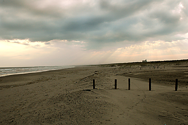
| The horizon doesn't bother me too much as the fence poles give the truer indication. Maybe this would have worked better in portrait mode with a lot of the irrelevant stuff cropped out and the photo's leading line heading to the light rays. |
|
 Photographer found comment helpful. Photographer found comment helpful. |
Comments Made During the Challenge  |
|
|
11/11/2004 06:49:56 PM |
| The horizon is leaning way too much imo, nice sunrays, but you should cut off a little of the uninteresting foreground. |
|
| Photographer found comment helpful. |
|
|
11/11/2004 04:03:33 PM |
the scene around when this picture was taken seems to be promising, but the picture as is lacks a focal point.
it appears that there are the beams from the clouds, which generally make for excellent pictures. perhaps you could have concentrated on that part for your picture. also, there are a large number of these posts in the background, and possibly they might have formed interesting lines had you chosen them for your subject.
as done, however, the subject appears to be the mud/sand in the foreground, which holds very little interest. also the line of poles cutting across don't contribute tha much. |
|
| Photographer found comment helpful. |
|
|
11/11/2004 07:34:57 AM |
| I like the light from the sky and the repetation of the poles. Let's try to crop the below out and make the front pole as foreground. I am not a professional photographer, but let me know if it helps. And the horizon maybe a little tilted. Not sure if you intended or not. 7 |
|
| Photographer found comment helpful. |
|
|
11/09/2004 06:45:11 PM |
The horizon is quite a bit tilted to the left. Nice sunrays in the far BG.
Bit too dull for my tastes (colour vise) - needs a litle more "sparkle" |
|
| Photographer found comment helpful. |
|
|
11/09/2004 10:58:28 AM |
if you're going to do a lot of burning, use your colour balance or a de-saturation tool when you're done to lose the blue cast. Burning on an adjustment layer is the easiest way to control it.
Aside from that, very nice pic. I'm sure a few will mention the slanter horizon, but i don't mind it...together with the posts it leads your eye nicely to the H2O.
good luck,
Pedro |
|
| Photographer found comment helpful. |
|
|
11/08/2004 08:46:00 PM |
| A lower point of view might be good with this scene. |
|
| Photographer found comment helpful. |
|
|
11/08/2004 09:29:37 AM |
| the slanted horizon is disturbing |
|
| Photographer found comment helpful. |
|
|
11/08/2004 05:11:10 AM |
|
| Photographer found comment helpful. |
|
|
11/08/2004 04:13:08 AM |
|
| Photographer found comment helpful. |
|
|
11/08/2004 04:12:18 AM |
| NIce photo, it may have been nicer to not have the footprints running through the middle of the photo. |
|
| Photographer found comment helpful. |
|
|
11/08/2004 01:21:40 AM |
| Photo tilted to the left and subject does not hold much interest. Horizon cuts photo in half. |
|
| Photographer found comment helpful. |
Home -
Challenges -
Community -
League -
Photos -
Cameras -
Lenses -
Learn -
Help -
Terms of Use -
Privacy -
Top ^
DPChallenge, and website content and design, Copyright © 2001-2025 Challenging Technologies, LLC.
All digital photo copyrights belong to the photographers and may not be used without permission.
Current Server Time: 03/16/2025 07:54:56 AM EDT.