| Author | Thread |
Comments Made During the Challenge  |
|
|
02/09/2003 03:24:49 PM |
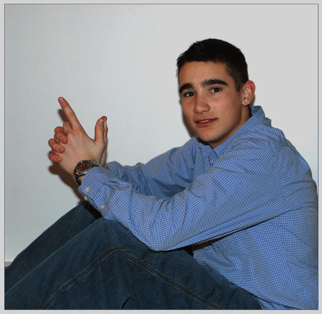
| The shirt gives the photo nice texture. There is too much negative space. |
|
 Photographer found comment helpful. Photographer found comment helpful. |
|
|
02/07/2003 09:25:38 AM |
| Nice one. Don't like the shadows, even though there aren't too many. Good color, rich and vivid and very natural. Good focus and ighting, except for the shadows. Nice composition, not too cramped, nor too airy, but just the right amount of space. Good model, very natural pose , nice looking and beautiful expression, very photogenic. Would rank up there in a portrait contest. You appear to have a talent for this type of photography. Beautiful photo. |
|
| Photographer found comment helpful. |
|
|
02/05/2003 09:49:10 PM |
|
| Photographer found comment helpful. |
|
|
02/05/2003 01:42:40 PM |
| Decent posing, but the flat lighting, harsh shadows, and close proximity to the background do no justice to the shot. |
|
| Photographer found comment helpful. |
|
|
02/05/2003 11:54:55 AM |
| Great shot! Nice pose and expression and I love the crop. I don't like the shadows though, not sure if they were there on purpose or not but I think it would be better to sit out from the wall a little more to soften them. Handsome young man. |
|
| Photographer found comment helpful. |
|
|
02/04/2003 07:20:12 PM |
|
| Photographer found comment helpful. |
|
|
02/04/2003 03:58:23 AM |
| He doesn't look ready! Buy him a real gun for pete's sake! jk. Nice use of shadows on the white wall and an interesting compostion that renders nice negative space and line forms. Something is just too drab about the focus and colors. A boy and a photo to be proud of! |
|
| Photographer found comment helpful. |
|
|
02/03/2003 02:17:05 PM |
| Great composition. I find the lighting a bit harsh and the shadow distracting. Looks like an on-camera flash shot. Another light or two stragically placed would have helped produce a more pleasing shot with less harsh shadows. good title. |
|
| Photographer found comment helpful. |
|
|
02/03/2003 02:15:21 PM |
| What a different picture, i really dont like picures of people. |
|
| Photographer found comment helpful. |
|
|
02/03/2003 09:51:27 AM |
| The shadows behind the subject really distract and distort the profile. |
|
| Photographer found comment helpful. |
|
|
02/03/2003 12:19:52 AM |
| This is a pretty good portrait although my eyes are drawn to his hands rather than his face. I think it's because they are lighter. Composition is very good although the white background is perhaps a little too stark. Focus is good, colour is good. Finally, the shadows are a little harsh - perhaps a second light source would be good. Having said all that though - still a lovely portrait. |
|
| Photographer found comment helpful. |
Home -
Challenges -
Community -
League -
Photos -
Cameras -
Lenses -
Learn -
Help -
Terms of Use -
Privacy -
Top ^
DPChallenge, and website content and design, Copyright © 2001-2025 Challenging Technologies, LLC.
All digital photo copyrights belong to the photographers and may not be used without permission.
Current Server Time: 03/12/2025 09:13:24 PM EDT.