| Author | Thread |
|
|
03/29/2017 04:26:38 PM |
Hello from the critique club
An appealing image that meets the challenge
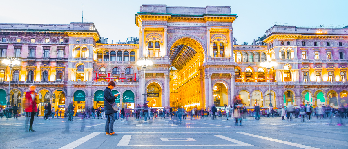
I like your low viewpoint and use of motion blur from the long exposure. The placement of your main person is good with lots of added interest from all the other people too. I agree and disagree with one of your commenters, I agree that a little less exposure would help the saturation of the colours but I disagree about the composition. I like the lack of symmetry but more important if you had done as suggested you would have lost that love golden arch and inner wall, that is such a powerful element in the image it needs to stay. You could perhaps have altered the composition by moving it further to the right. All in all good creative vision well done Jonathon. |
|
 Photographer found comment helpful. Photographer found comment helpful. |
Comments Made During the Challenge  |
|
|
03/28/2017 11:02:18 PM |
| I love the look of this. Top shot. |
|
| Photographer found comment helpful. |
|
|
03/22/2017 11:05:05 AM |
| Making the picture a little darker and it would benefit the over-saturation much more. I like the longer exposure effect on the people very much. If you moved more to the right and get right in front of the gallery entrance, you should get a more appealing symmetry. A 6 from me. |
|
| Photographer found comment helpful. |
Home -
Challenges -
Community -
League -
Photos -
Cameras -
Lenses -
Learn -
Help -
Terms of Use -
Privacy -
Top ^
DPChallenge, and website content and design, Copyright © 2001-2025 Challenging Technologies, LLC.
All digital photo copyrights belong to the photographers and may not be used without permission.
Current Server Time: 04/29/2025 04:33:13 AM EDT.