| Author | Thread |
Comments Made During the Challenge  |
|
|
11/14/2004 05:11:18 AM |
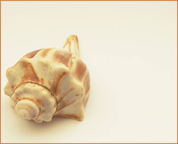
| too bright ( I don't see it as high key). I guess some detail is loss because of it |
|
|
|
11/13/2004 06:52:22 PM |
| I like the composition, a good use of negative space |
|
 Photographer found comment helpful. Photographer found comment helpful. |
|
|
11/12/2004 11:42:12 AM |
| The crop is a bit too close on the left, it looks awkward. The lighting is good, but I'm not keen on the border. A white one would have worked better I think. |
|
|
|
11/11/2004 10:21:55 AM |
| good subject, nice warm lighting... not sure about the composition. |
|
| Photographer found comment helpful. |
|
|
11/10/2004 09:59:52 PM |
| Nice composition of a simple subject. I think this photo would benefit from a bit more contrast, though it does look pretty good in subdued tones as well. And I think the border you chose actually does a good job of enhancing the photo, rather than detracting from it. |
|
| Photographer found comment helpful. |
|
|
11/10/2004 08:55:22 PM |
| Composition was strong. For a more dramatic impact, more focus was needed on the subject. |
|
| Photographer found comment helpful. |
|
|
11/10/2004 05:02:21 PM |
| I would like to see this with a lighter background,not necessarily white, but lighter than this. It is almost too close to the color of the shell. |
|
| Photographer found comment helpful. |
|
|
11/10/2004 10:34:44 AM |
|
| Photographer found comment helpful. |
|
|
11/10/2004 12:33:18 AM |
| Good quality, boring subject... IT fits the challenge, yes, but still, it should be interesting, imo. |
|
| Photographer found comment helpful. |
Home -
Challenges -
Community -
League -
Photos -
Cameras -
Lenses -
Learn -
Help -
Terms of Use -
Privacy -
Top ^
DPChallenge, and website content and design, Copyright © 2001-2025 Challenging Technologies, LLC.
All digital photo copyrights belong to the photographers and may not be used without permission.
Current Server Time: 03/12/2025 10:54:03 PM EDT.