| Author | Thread |
Comments Made During the Challenge  |
|
|
11/23/2004 04:42:28 PM |
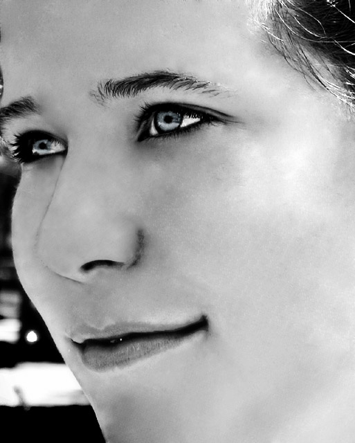
| if you look at the mouth corner, it becomes obvious that the contrast ratio is to high and the the usm levels where to high as well. because of this, many aberations appeared. |
|
|
|
11/22/2004 09:07:29 PM |
| I think she doesn't have enough space for her look... |
|
|
|
11/22/2004 03:34:39 AM |
| Is this really basic editing (thinking mainly of the eyes)? |
|
|
|
11/21/2004 07:05:04 PM |
Somebody's got an unsharp mask fetish.
:)
Nice picture, I see the artistic use of the tool. But I think the composition would be improved if you gave her some space to look into. If there were about a third more width to the image, on the left side, it would feel more balanced.
Keep it up! |
|
|
|
11/21/2004 03:39:17 PM |
|
|
|
11/20/2004 07:35:24 AM |
| WOW, love the reflection off the eyes. Great focus. Feels like there is a really sharp focus around the eyes, but a very soft feel everywhere else. I like this a lot. |
|
|
|
11/17/2004 09:30:10 PM |
| The eyes look blue, or is it my imagination? |
|
|
|
11/17/2004 07:26:16 PM |
|
|
|
11/17/2004 01:09:16 PM |
| The eyes are amazing - and I like the contrast in the photo. But this looks a bit too processed - almost like a charcoal drawing. Neat image? |
|
 Photographer found comment helpful. Photographer found comment helpful. |
|
|
11/17/2004 10:48:17 AM |
| IMO this suffers dramatically from over processing. It was obviously intentional, but does not suit my taste. 3 |
|
| Photographer found comment helpful. |
Home -
Challenges -
Community -
League -
Photos -
Cameras -
Lenses -
Learn -
Help -
Terms of Use -
Privacy -
Top ^
DPChallenge, and website content and design, Copyright © 2001-2025 Challenging Technologies, LLC.
All digital photo copyrights belong to the photographers and may not be used without permission.
Current Server Time: 03/13/2025 04:48:15 PM EDT.