| Author | Thread |
Comments Made During the Challenge  |
|
|
11/22/2004 11:23:16 AM |
| The composition leavse a lot to be desired, but you have potential. |
|
|
|
11/19/2004 06:47:33 PM |
|
|
|
11/18/2004 04:01:35 PM |
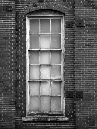
| Although it is centered, there are a lot of different things on either side to keep it from becoming static. I like the 3-3-3 top to bottom and side by side. Only nit is in the post processing. To much sharpening and not as much detail as all those bricks would imply is really there. |
|
|
|
11/17/2004 07:24:19 PM |
|
 Photographer found comment helpful. Photographer found comment helpful. |
|
|
11/17/2004 04:15:40 PM |
| Technically a good shot so I wouldn't score this low, but IMO not particulary exciting or interesting subject. |
|
|
|
11/17/2004 12:25:41 PM |
i like it! personally I'd have shifted the window in the frame to the left a liiiittle more, but that's just me. a little extra contrast would be awesome as well, particularly darker blacks (the burn tool would be perfect, but you can't use that in basic editing. gr). one of the better images i've come across so far. well done.
P |
|
| Photographer found comment helpful. |
Home -
Challenges -
Community -
League -
Photos -
Cameras -
Lenses -
Learn -
Help -
Terms of Use -
Privacy -
Top ^
DPChallenge, and website content and design, Copyright © 2001-2025 Challenging Technologies, LLC.
All digital photo copyrights belong to the photographers and may not be used without permission.
Current Server Time: 03/13/2025 09:59:06 AM EDT.