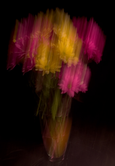
| I like this effect, and I feel like it's really close to impressionistic, even though the motion is obvious. What I think makes it better is that the base of the vase doesn't display any of the motion blur. That seems to anchor it, or make it harder, while the blur on the flowers softens them, and that's good. The dark background is a negative, I think, but I'm sure the lack of light bouncing around contributed to the positive I mentioned above. Overall, probably above the 75th percentile, had it been in the recent Impressionism challenge, in my opinion. |