| Author | Thread |
|
|
11/22/2004 07:29:38 AM |
Congrats on your first brownie!!!
I thought i was gonna get it!
I personally don't care for this image (or any except about 4 or 5)
I don't even like mine.
Your a terrific photographer, (everyone who competed is) and this is a technique (impressionism) that i just don't like. I love photography, but i'm no painter!
well,
congrats again :)
Peace,
E |
|
|
|
11/22/2004 06:50:59 AM |
| From a blue to a brown!! My first ever brown!!! My collection is complete!!!!! Woohoo!!! :-D |
|
|
|
11/22/2004 01:29:50 AM |
| The first shall be last and the last shall be first? I still like this one! |
|
|
|
11/22/2004 12:36:21 AM |
| I gave this an 8 and thought it was lovely... :o) |
|
|
|
11/22/2004 12:16:27 AM |
(unhelpful comment removed by author)
See here
Message edited by author 2005-10-05 01:45:19. |
|
Comments Made During the Challenge  |
|
|
11/21/2004 08:39:34 PM |
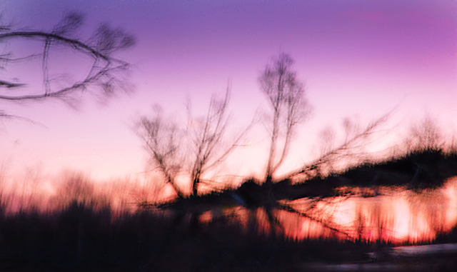
| The blur is a bit distracting from the beauty of it... It's a little bit too much blur. |
|
|
|
11/21/2004 07:18:16 PM |
Invitational Challenge Level: Experienced
Challenge link: medium.
Image critique: while this scene is now an impression of the subject, it can only really be said that it is such due solely to camera shake! For me it requires a degree more depth and compositional planning to deliver the feeling of impressionism than simply distorting the scene.
Colours are pleasant but the feeling of blur just overpowers the emotive nature of the photo.
Out-of-challenge appeal: not a great deal due to the technique whcih has been applied only for meeting this challenge.
Score: 4 |
|
 Photographer found comment helpful. Photographer found comment helpful. |
|
|
11/20/2004 09:44:01 PM |
|
|
|
11/19/2004 03:00:31 PM |
| Maybe too much blur.. Almost hard to get the feel for this one.. The colors are wonderful and the silouhettes are nice. |
|
|
|
11/19/2004 12:42:15 PM |
| the tilt of the tree/brush line up & to the right confuses my sense of what is being shown |
|
|
|
11/17/2004 08:12:08 PM |
| The colour is great, and while I could probably live with the soft look I don't like the big black blotch across the photo at all. What is it? |
|
| Photographer found comment helpful. |
|
|
11/16/2004 08:37:42 AM |
| Lovely variation in colour...I find the branch on the left of the picture a bit distracting though..otherwise fits the theme well. |
|
|
|
11/15/2004 11:49:53 PM |
returning for comments.
Great displacement effect and a very good overall tranquil feel. Bumping up. |
|
| Photographer found comment helpful. |
|
|
11/15/2004 08:25:16 PM |
| Good try but I just feel that if there are two components to this photograph (the original image and the camera technique/distortion/filter) then together they don't amount to more than the sum of their individual parts. |
|
| Photographer found comment helpful. |
|
|
11/15/2004 05:06:30 PM |
| while i might enjoy this image without the impressionistic attempt, i am not enjoying looking at it here. there are some elements i can relate to, but my eyes are having a hard time reconcilling competing shapes and colors. most of the impressionist work i enjoy allows my eye to soak in and absorb the image; that is not happening for me here. |
|
| Photographer found comment helpful. |
|
|
11/15/2004 11:02:36 AM |
| Beautiful colours, but let down by weak composition. I'd also have liked to see a little more clarity... it's too blurred for my taste. 5 |
|
| Photographer found comment helpful. |
Home -
Challenges -
Community -
League -
Photos -
Cameras -
Lenses -
Learn -
Help -
Terms of Use -
Privacy -
Top ^
DPChallenge, and website content and design, Copyright © 2001-2025 Challenging Technologies, LLC.
All digital photo copyrights belong to the photographers and may not be used without permission.
Current Server Time: 04/21/2025 11:01:57 PM EDT.