| Author | Thread |
Comments Made During the Challenge  |
|
|
11/23/2004 04:23:40 PM |
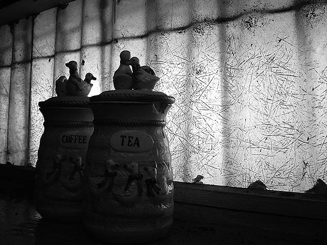
| I like the photo and I'd pick the Coffee about now ;-). Anyways, good work on this however I find that the background has good lighting yet the subject (in my view) doesn't have enough lighting on it. If it was the other way around you would have had a great photo in my opinion. Keep shooting! |
|
 Photographer found comment helpful. Photographer found comment helpful. |
|
|
11/18/2004 06:36:10 PM |
| Very interesting lighting and background. Foreground could use a splash more light in my opinion. |
|
| Photographer found comment helpful. |
|
|
11/18/2004 02:29:15 PM |
| Too dark. I don't really like it sorry. |
|
| Photographer found comment helpful. |
|
|
11/18/2004 01:36:01 PM |
| I'd like to see a bit less shadow on the foreground jars to make their detail more accessible. |
|
| Photographer found comment helpful. |
|
|
11/18/2004 07:01:30 AM |
| I think I understand your choice for this exposure. While it adds to the message I take from this photograph, I had to overcome a strong negative first impression in order to see the message. |
|
| Photographer found comment helpful. |
|
|
11/18/2004 06:23:43 AM |
|
| Photographer found comment helpful. |
|
|
11/17/2004 11:15:33 PM |
| I like the light patterns upon the illuminated background. Cool sillhoutte, but I wish I could see most of it or not of it. |
|
| Photographer found comment helpful. |
|
|
11/17/2004 07:27:05 PM |
|
| Photographer found comment helpful. |
|
|
11/17/2004 01:32:28 PM |
| nice!! great window texture and darker inside works... if i saw an "echoed" spout on the coffee pot it would work better for me though |
|
| Photographer found comment helpful. |
|
|
11/17/2004 11:21:03 AM |
to me, pgotography is primarily about light. this one could either use a little more or a little less, depending on what you're going for. I really like the backlighting idea using the firbeglass wall (a shed or barn I'd assume), but the cannisters seem like they need to either be brought out a bit, or completely silhouetted. A single spot light cast from the direction of your camera would help i think. if this weren't a basic challenge, you could dodge the cannisters a bit and just bring out the highlights a wee bit. This is just my opinnion of course - ignore it if this is the look you're going for :) 6 from me.
P |
|
| Photographer found comment helpful. |
|
|
11/17/2004 09:42:50 AM |
| I like the texture on the wall. I would have liked the photo better if there had been some light on the jars. Also, the composition doesn't seem balanced, but I'm not expert. 6 |
|
| Photographer found comment helpful. |
Home -
Challenges -
Community -
League -
Photos -
Cameras -
Lenses -
Learn -
Help -
Terms of Use -
Privacy -
Top ^
DPChallenge, and website content and design, Copyright © 2001-2025 Challenging Technologies, LLC.
All digital photo copyrights belong to the photographers and may not be used without permission.
Current Server Time: 04/27/2025 08:02:10 PM EDT.