| Author | Thread |
Comments Made During the Challenge  |
|
|
11/20/2004 06:04:43 PM |
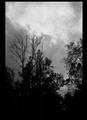
| Not sure if the tilt is intentional or not, but kindof gives me an uneasy feeling. Nice lighting. |
|
 Photographer found comment helpful. Photographer found comment helpful. |
|
|
11/19/2004 09:38:13 PM |
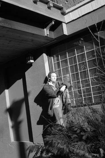
| I might've cropped in closer on the subject to capture more of his shadow and reflection in the window and eliminate the lamp shadow and balcony above. |
|
| Photographer found comment helpful. |
|
|
11/19/2004 05:58:49 PM |
| I'm not sure I like the angle on this - it seems to distract rather than add action or drama. Nice composition though. |
|
| Photographer found comment helpful. |
|
|
11/18/2004 10:27:44 PM |
| The face is quite overexposed. |
|
| Photographer found comment helpful. |
|
|
11/18/2004 12:28:25 PM |
| This may be weird, but my favorite part of this is the lamp's shadow. |
|
| Photographer found comment helpful. |
|
|
11/18/2004 11:55:09 AM |
|
| Photographer found comment helpful. |
|
|
11/17/2004 10:08:44 PM |
| I like the shadow of the lampost and the white lines of the bars against the darker window, but the face of the model is a bit washed out by the light source. It is the only thing that disappoints me here. Otherwise...nice! One more think...I would have cropped out the roof. It changes where my eyes are drawn completely. I am viewing the picture now with the image cust off just above the models head. It is find this way for me....add that roof, it gets a bit busy! |
|
| Photographer found comment helpful. |
|
|
11/17/2004 07:22:52 PM |
|
| Photographer found comment helpful. |
|
|
11/17/2004 12:17:07 PM |
| like the shape of this one but the lamp post shadow and the twigs running over the man make it a bit confusin, but i really do enjoy the angle and textures used |
|
| Photographer found comment helpful. |
|
|
11/17/2004 07:47:01 AM |
| This is a great shot. IMHO you should try to come up with a creative title for your entries. I really like the shadows. 8 |
|
| Photographer found comment helpful. |
|
|
11/17/2004 02:36:26 AM |
| I'd like to see the focus on the face, and the exposure adjusted so his skin isn't blown out. Nice dutch angle. |
|
| Photographer found comment helpful. |
Home -
Challenges -
Community -
League -
Photos -
Cameras -
Lenses -
Learn -
Help -
Terms of Use -
Privacy -
Top ^
DPChallenge, and website content and design, Copyright © 2001-2025 Challenging Technologies, LLC.
All digital photo copyrights belong to the photographers and may not be used without permission.
Current Server Time: 03/12/2025 11:32:31 AM EDT.