| Author | Thread |
Comments Made During the Challenge  |
|
|
11/22/2004 09:50:38 AM |
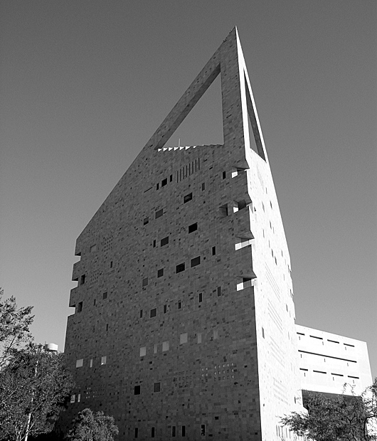
| Light side lacks detail, so I'd say this is overexposured. |
|
|
|
11/21/2004 09:16:37 AM |
| Very interesting subject and I think the B&W fits it well. The two faces of the building having such a discrepancy of lighting helps to emphasize the sharpness of the building's facade. |
|
 Photographer found comment helpful. Photographer found comment helpful. |
|
|
11/20/2004 12:38:06 AM |
| The image draws the eye upward so I find it incongruent with your title. The photo is washed out, but the light and shadow at the front edges is really quite nice. I think that should be your focal point. Interesting angle, but the image doesn't seem complete. I would try cropping it a variety of ways. I am not sure what would be best; I would want to play with it a bit. I think it is the way the trees are cut in half that gives it an unfinished look. |
|
| Photographer found comment helpful. |
|
|
11/19/2004 08:07:48 PM |
|
| Photographer found comment helpful. |
|
|
11/18/2004 02:54:45 PM |
| Nice, I love the sky. Very well exposed. |
|
| Photographer found comment helpful. |
|
|
11/17/2004 08:38:21 PM |
| light a bit too harsh on R of building. |
|
| Photographer found comment helpful. |
|
|
11/17/2004 07:56:39 PM |
| definantly. concrete wil never be in style. good angle. |
|
| Photographer found comment helpful. |
|
|
11/17/2004 08:47:42 AM |
| Good subject choice, but if the glare on the right side of the building could have been reduced it would have been better. |
|
| Photographer found comment helpful. |
Home -
Challenges -
Community -
League -
Photos -
Cameras -
Lenses -
Learn -
Help -
Terms of Use -
Privacy -
Top ^
DPChallenge, and website content and design, Copyright © 2001-2025 Challenging Technologies, LLC.
All digital photo copyrights belong to the photographers and may not be used without permission.
Current Server Time: 03/12/2025 09:11:09 AM EDT.