| Author | Thread |
Comments Made During the Challenge  |
|
|
11/23/2004 06:59:21 PM |
| nice picture & perfect title. Forgive the pun, but the tones are a little flat - maybe some more contrast would make this pop |
|
|
|
11/23/2004 12:44:39 PM |
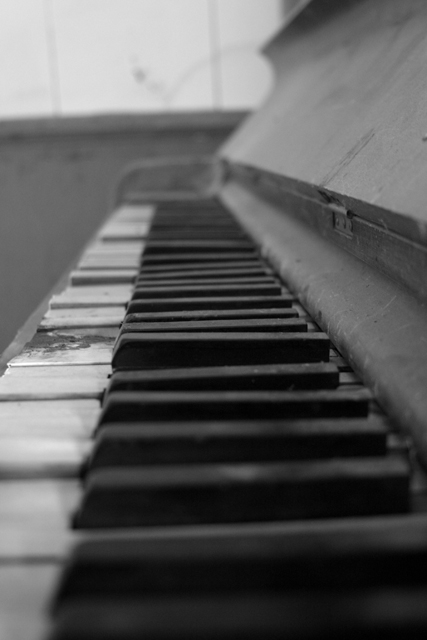
| I like how the piano is well worn and well loved. It seems many a finger has tiptoed on these ivory stairs. Good focus on the one protruding key. (8) |
|
|
|
11/23/2004 11:08:21 AM |
Liked this
good tonal texture |
|
|
|
11/22/2004 07:36:51 PM |
| i like the focus right in the range of the ruined/destroyed keys - nice use of shallow dof. |
|
|
|
11/21/2004 09:31:40 AM |
| Cool old piano. Nice shot, but I think a slightly deeper DOF would have been even better. |
|
|
|
11/20/2004 09:31:45 PM |
|
|
|
11/20/2004 05:16:08 PM |
| Nice nostalgic shot. Seems a little tilted to me (check out //www.dpchallenge.com/tutorial.php?TUTORIAL_ID=21). Nice angle. |
|
|
|
11/19/2004 05:28:58 PM |
|
|
|
11/19/2004 04:14:01 PM |
| perhaps better with the first keys in focus |
|
|
|
11/18/2004 07:52:48 PM |
| I think this is a good idea. I think it would have been better if you had composed the shot so the keys were more diagonal from corner to corner. But that's just my opinion. 5 |
|
|
|
11/18/2004 01:09:00 PM |
| Very nice rustic look. i like the depth of field, although I think it would look nicer if more was cropped off the bottom. |
|
|
|
11/18/2004 03:31:47 AM |
| Larger DOF might have been better? |
|
|
|
11/17/2004 07:18:24 PM |
|
|
|
11/17/2004 12:10:23 PM |
nice, needs a little more contrast IMO
|
|
|
|
11/17/2004 07:27:33 AM |
| Nice use of shallow DOF, it´s a good shot, only thing I want to nitpick about is that maybe you should have boosted the contrast by a bout +5 or +10 in photoshop, it seems a little bit flat. |
|
|
|
11/17/2004 07:05:57 AM |
| This image could use a little more contrast imho. The blacks to be real black. |
|
|
|
11/17/2004 06:08:13 AM |
|
|
|
11/17/2004 01:36:58 AM |
| I would have liked this more if the DoF wasn't so shallow. |
|
|
|
11/17/2004 12:37:47 AM |
| Great composition! It looks just slightly flat, but that just adds to the old dusty feel of it. very nice work and creative use of depth. |
|
Home -
Challenges -
Community -
League -
Photos -
Cameras -
Lenses -
Learn -
Help -
Terms of Use -
Privacy -
Top ^
DPChallenge, and website content and design, Copyright © 2001-2025 Challenging Technologies, LLC.
All digital photo copyrights belong to the photographers and may not be used without permission.
Current Server Time: 03/12/2025 09:32:53 AM EDT.