| Author | Thread |
|
|
11/29/2004 12:29:42 PM |
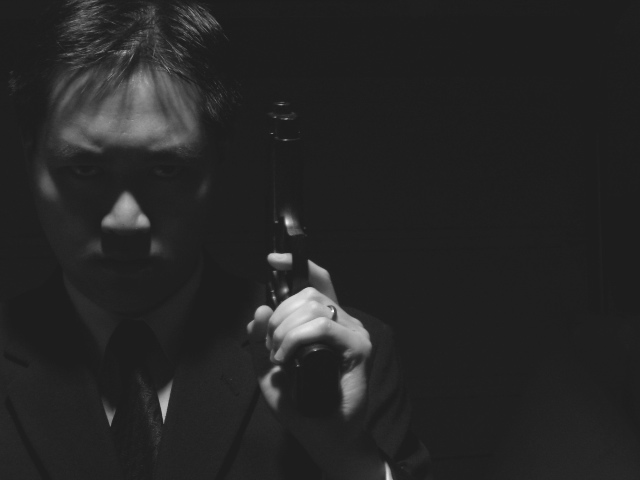
| Dark yes, but I kind of like it. A bit more contrast on the hand would have made the shot. |
|
 Photographer found comment helpful. Photographer found comment helpful. |
Comments Made During the Challenge  |
|
|
11/23/2004 09:46:12 PM |
| your black seems washedout. Dim the brightness in GIMP |
|
| Photographer found comment helpful. |
|
|
11/23/2004 08:06:58 PM |
| Effectively dark and dismal. Good job. |
|
| Photographer found comment helpful. |
|
|
11/23/2004 11:23:02 AM |
|
| Photographer found comment helpful. |
|
|
11/22/2004 08:39:53 PM |
| There will be the sweetness and light brigade who will insist you brighten this image. Do not listen. This is a great photo and reminds me of everything from James Bond to The Matrix. You did a fine job, friend. (9) |
|
| Photographer found comment helpful. |
|
|
11/22/2004 04:54:22 PM |
| Scary. Could use a little more contrast and it looks a little too blurry. |
|
| Photographer found comment helpful. |
|
|
11/21/2004 04:52:26 PM |
| A bit more contrast would have made this one much better. The lighting is great, though. I like that sinister look. But I don't think a professional would be married. The ring doesn't fit in. |
|
| Photographer found comment helpful. |
|
|
11/21/2004 03:16:02 PM |
| Intersting idea, I like the dark feel, but I think just a little more light would have helped to see the gun better. Plus the wedding band doesn't exactly ring true to the hit man theme :) |
|
| Photographer found comment helpful. |
|
|
11/21/2004 12:27:03 AM |
| Nice, i think it needs a little more contrast and brightness and to be flipped horizontally. |
|
| Photographer found comment helpful. |
|
|
11/19/2004 09:50:47 PM |
| Use a brighter light, or possibly a silver gun, it almost works exceedingly well, but dosnt quite finish it. perhaps just more contrast, make parts vanish (noteably not the gun) and draw the other parts up more. |
|
| Photographer found comment helpful. |
|
|
11/19/2004 08:20:02 PM |
| Nicely done "dark" picture. Maybe just a touch more light on the face. Let us see the expresion just a little more. |
|
| Photographer found comment helpful. |
|
|
11/19/2004 05:09:30 PM |
| cool shot, great expression, nice lighting- but whatever is in the background is too dark to make out but just visible enough to be distracting. |
|
| Photographer found comment helpful. |
|
|
11/19/2004 12:20:27 PM |
| nice shadows... coulda cast some light near the eyes to bring'em out .. but its a beautifull God father kinda image.. i like it 7 |
|
| Photographer found comment helpful. |
|
|
11/19/2004 11:29:55 AM |
| like the space you left on the right, nicely litfor the moody eyes. |
|
| Photographer found comment helpful. |
|
|
11/18/2004 10:36:15 PM |
| It looks a little muddy - maybe some levels and contrast adjustment. I do like your effort though. |
|
| Photographer found comment helpful. |
|
|
11/18/2004 08:12:43 PM |
| Lighting idea seems good, but not enough light on the face...needs a little more light on eyes I think |
|
| Photographer found comment helpful. |
|
|
11/18/2004 03:04:20 PM |
| A little dark. And not very natural. |
|
| Photographer found comment helpful. |
|
|
11/17/2004 07:25:36 AM |
| This could have been a very very good shot but unfortunately the eyes are just barely visible and so much in this shot, in my opinion, rests on his expression and because you can´t really make it out (my monitor is calibrated, by the way) it loses a lot of impact. Anyway, what I am trying to say is that I like this shot a lot but feel that it really didn´t hit the target, but definately keep it up, this is very promising. |
|
| Photographer found comment helpful. |
Home -
Challenges -
Community -
League -
Photos -
Cameras -
Lenses -
Learn -
Help -
Terms of Use -
Privacy -
Top ^
DPChallenge, and website content and design, Copyright © 2001-2025 Challenging Technologies, LLC.
All digital photo copyrights belong to the photographers and may not be used without permission.
Current Server Time: 03/12/2025 05:38:23 PM EDT.