| Author | Thread |
Comments Made During the Challenge  |
|
|
11/22/2004 08:37:50 PM |
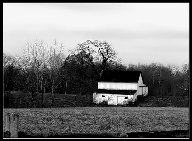
| In North Carolina barns such as these are as part on the landscape and any tree or stone. Indeed, the things are so old at times they seem to have grown there. I would keep the bottom of the fence. So consider that if people are teeling you to crop it out. I kind of like it. (7) |
|
 Photographer found comment helpful. Photographer found comment helpful. |
|
|
11/22/2004 07:20:19 AM |
| Killing contrast might work better if the roof would be distinguishable from the woods. If this wasn't shot on film, try to find contrast from different channels (I guess green would display some difference on roof and woods). Otherwise I like the contrast, as the detail is still present. Composition is a bit odd on bottom, and there's feeling the image is not straight even though it might be. |
|
| Photographer found comment helpful. |
|
|
11/21/2004 08:38:42 PM |
| Good contrast of black and white on this old barn. I think you would have been better off without the partial fence in the forground. |
|
| Photographer found comment helpful. |
|
|
11/21/2004 02:47:42 PM |
| get the fence out of the front and check your exposure. It has the makeings of a 10 but just those two little deatials. |
|
| Photographer found comment helpful. |
|
|
11/19/2004 11:10:34 PM |
| Fence is a little distracting. White stands out well, good composition. |
|
| Photographer found comment helpful. |
|
|
11/19/2004 06:31:14 PM |
| I think that the trees in the center need more contrast. Now there in not much interesting to capture the attention there(in the trees) |
|
| Photographer found comment helpful. |
|
|
11/18/2004 02:04:49 PM |
| strong contrast...excellent |
|
| Photographer found comment helpful. |
|
|
11/18/2004 07:58:30 AM |
| I'd like to see more of the fence at the bottom or you could get lower to the ground and leave the fence out all together. The old barn makes a nice rural subject. |
|
| Photographer found comment helpful. |
|
|
11/17/2004 11:33:26 PM |
| Would have given this photo a higher mark if you would have framed it with the fence more! |
|
| Photographer found comment helpful. |
|
|
11/17/2004 07:32:09 PM |
| This si somewhat of a plain picture. If more of the fence was seen, It would look like a deep DOF picture. Maybe if there was more to see closer, it would give the viewer more to look at |
|
| Photographer found comment helpful. |
|
|
11/17/2004 07:28:38 PM |
|
| Photographer found comment helpful. |
|
|
11/17/2004 05:39:37 PM |
| Nice composition and lighting levels. There's a perception of incorect clockwise rotation. (The vertical corners of the main building ought to be straight up and down I think.) But for that, an 8. Well done. |
|
| Photographer found comment helpful. |
|
|
11/17/2004 04:31:39 PM |
| maybe it's just me, but the fence at the bottom of the photo distracts from an otherwise great composition. I think if it were cropped out it would have a more fluid feel |
|
| Photographer found comment helpful. |
|
|
11/17/2004 09:17:00 AM |
| It looks like too much contrast to me. The roof is too black, and the walls are too white. |
|
| Photographer found comment helpful. |
|
|
11/17/2004 09:11:08 AM |
| very nice, capturing! I like the feel, and texture of the picture it works well. |
|
| Photographer found comment helpful. |
Home -
Challenges -
Community -
League -
Photos -
Cameras -
Lenses -
Learn -
Help -
Terms of Use -
Privacy -
Top ^
DPChallenge, and website content and design, Copyright © 2001-2025 Challenging Technologies, LLC.
All digital photo copyrights belong to the photographers and may not be used without permission.
Current Server Time: 03/12/2025 07:37:15 AM EDT.