| Author | Thread |
Comments Made During the Challenge  |
|
|
11/23/2004 07:45:05 PM |
| It's a fun, experimental kind of shot. |
|
 Photographer found comment helpful. Photographer found comment helpful. |
|
|
11/23/2004 11:21:39 AM |
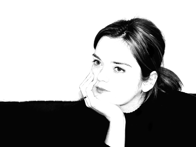
| This is really interesting. The horizon you created with the darkness in the photo gave emphasis to your subject's face and the contrasting darks and lights in her face |
|
| Photographer found comment helpful. |
|
|
11/23/2004 10:43:18 AM |
| I really enjoy looking at this. It is almost liek a charcoal drawing and the eyes are lovely. I would be interested to see a similar treatment with the model looking at the camera as I wonder if that wouldn't have an even stronger connection with the viewer. But this is one of my favorites. 9 |
|
| Photographer found comment helpful. |
|
|
11/23/2004 09:26:31 AM |
|
|
|
11/23/2004 02:23:24 AM |
| Very cool shot. Not too many images seem to do well with the high contrast thing, but that works very well with this - really brings out her eyes. Nice job. |
|
| Photographer found comment helpful. |
|
|
11/22/2004 09:59:50 AM |
| This version of high-key doesn't attract all the attention to the face, like fabrics and background would imply, but lot of it goes to well rendered hair. So maybe needs a bit more push on those shades. |
|
| Photographer found comment helpful. |
|
|
11/21/2004 04:56:43 PM |
| Goood picture, interesting exposure! |
|
| Photographer found comment helpful. |
|
|
11/21/2004 10:47:38 AM |
Appears a tad overexposed. My guess is that the camera metered off the white wall. Did this myself. May try to spot meter off the face. If you did this then just tell me where to go!
:) |
|
| Photographer found comment helpful. |
|
|
11/20/2004 07:08:19 PM |
| This would of been better with a completly white background so you could see the shoulders....but still a very nice shot....8 |
|
| Photographer found comment helpful. |
|
|
11/20/2004 11:19:04 AM |
| The four-quadrant composition idea is great, but the bland facial expression is a drawback 7 |
|
| Photographer found comment helpful. |
|
|
11/19/2004 09:38:16 PM |
| I like the way you've split the frame visually, and the placement of the head crossing the boundary is a very unique effect. It's a bit too "high key" for me, would like a touch more detail in the skin, but I really like what you are trying to do with this. |
|
| Photographer found comment helpful. |
|
|
11/19/2004 12:36:46 PM |
| The light is far too harsh, too dark in half and far too light in the other. |
|
| Photographer found comment helpful. |
|
|
11/19/2004 04:55:03 AM |
| Just not in focus enough for my tastes. I really like the overall look and feel though. When I attempt this type of photography, it never *ever* looks even half this good. |
|
| Photographer found comment helpful. |
|
|
11/18/2004 09:20:21 PM |
I'm getting lots of dumb comments on my high-key photo... I hope you're not suffering the same fate. Seems some people don't understand... Anyway, I like your photo! The high key works well. And the horizontal line, broken by her arm and hand is intriguing. Love the detail in her eyes! Good luck in the challenge!
|
|
| Photographer found comment helpful. |
|
|
11/18/2004 08:58:36 PM |
| I'm not terrible keen on high key, but this is a good example of it. There is too much space on the left for my tastes. 6 |
|
| Photographer found comment helpful. |
|
|
11/18/2004 12:38:09 PM |
| Cool shot, nice composition and pose. Awsome portrait. |
|
| Photographer found comment helpful. |
|
|
11/18/2004 11:54:41 AM |
| a little over exposed IMO |
|
| Photographer found comment helpful. |
|
|
11/17/2004 07:52:13 PM |
|
| Photographer found comment helpful. |
|
|
11/17/2004 07:17:17 PM |
|
| Photographer found comment helpful. |
|
|
11/17/2004 04:41:01 PM |
| A bit too much contrast for my taste, gives it a flat feeling. |
|
| Photographer found comment helpful. |
|
|
11/17/2004 04:08:29 PM |
| Interesting shot and interesting use of the high key technique. The line across the middle of her is bothering me however. |
|
| Photographer found comment helpful. |
|
|
11/17/2004 02:45:10 PM |
| The highlights were just blown out too much to me so she blends into the background where she doesn't stand out. |
|
| Photographer found comment helpful. |
|
|
11/17/2004 02:19:50 PM |
|
| Photographer found comment helpful. |
|
|
11/17/2004 02:15:33 PM |
| Lovely photograp, great expression however I feel there is too much black to the left of the model maybe would have been better to crop it a bit however (7) |
|
| Photographer found comment helpful. |
|
|
11/17/2004 12:37:19 AM |
| There are a lot of people who like this high-key style of shot. I'm not really a fan of it personally. I do like how the background splits between black and white. I cant really see anything technically wrong with this, it just doesnt have the visual impact for me. |
|
| Photographer found comment helpful. |
Home -
Challenges -
Community -
League -
Photos -
Cameras -
Lenses -
Learn -
Help -
Terms of Use -
Privacy -
Top ^
DPChallenge, and website content and design, Copyright © 2001-2025 Challenging Technologies, LLC.
All digital photo copyrights belong to the photographers and may not be used without permission.
Current Server Time: 03/12/2025 12:41:12 PM EDT.