| Author | Thread |
Comments Made During the Challenge  |
|
|
11/23/2004 11:29:31 PM |
|
|
|
11/23/2004 10:16:18 PM |
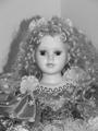
| Nice idea for the shot and great title to go along with it. I just wanted to point out that I'm seeing a lot of noise in this picutre, maybe the ISO was see too high? Just not as sharp as I would have liked it, maybe it could use some USM? Still great photo with a lot of potential. Keep up the good work ;-) |
|
|
|
11/23/2004 02:07:00 AM |
| This has good mood. Feels like a spaghetti western. Generally speaking, I prefer a little more dynamism in a piece, but this has good flavor. |
|
 Photographer found comment helpful. Photographer found comment helpful. |
|
|
11/20/2004 04:17:33 PM |
|
|
|
11/19/2004 08:26:41 PM |
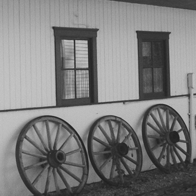
| Interesting subject - especially appropriate for B&W. However, the image looks a bit tilted. I think it could use a bump in brightness and contrast. I would prefer the first wheel not be cut off and the electrical conduit on the right cropped out. BOL |
|
| Photographer found comment helpful. |
|
|
11/19/2004 06:38:11 PM |
| This photo didn't really say anything to me, just felt kind of plain (or lacking in 'depth') 5 |
|
| Photographer found comment helpful. |
|
|
11/19/2004 02:52:20 AM |
| This is a great idea, but this just seems a bit OOF. |
|
| Photographer found comment helpful. |
|
|
11/18/2004 09:45:39 PM |
| Not very sharp, and quite flat. |
|
|
|
11/18/2004 03:22:06 PM |
| What a pity the first whel cut! |
|
|
|
11/18/2004 02:55:53 PM |
| Nice composition, if a little out of focus. |
|
| Photographer found comment helpful. |
|
|
11/18/2004 01:04:58 PM |
| The lack of sharpness and grainy backgrouns is distracting to me. Needs a more clear subject - without looking at the title I wouldn't know if i should be watching the wheels or the windows. |
|
|
|
11/17/2004 03:53:23 PM |
| a bit soft. More contrast would have made it more appealing and perhaps cropping in closer especially on the right.....Textures feel they should be a little rougher to make it a grittier shot. |
|
| Photographer found comment helpful. |
|
|
11/17/2004 12:03:51 PM |
| yikes. i am sure you had a great concept/.... but its fuzzy not clear and faded. not a bad idea for a photo, but the light and stuff confuses me, dosent have that pro look, which isnt "bad" but sticks out in an odd way |
|
|
|
11/17/2004 09:43:51 AM |
| Looks out of focus to me. If you were trying to make it look old timey, I don't feel it worked. |
|
Home -
Challenges -
Community -
League -
Photos -
Cameras -
Lenses -
Learn -
Help -
Terms of Use -
Privacy -
Top ^
DPChallenge, and website content and design, Copyright © 2001-2025 Challenging Technologies, LLC.
All digital photo copyrights belong to the photographers and may not be used without permission.
Current Server Time: 03/12/2025 01:42:04 PM EDT.