| Author | Thread |
|
|
12/01/2004 12:29:48 AM |
| Congratulations on your 14th placing. A dashing type of image with great angle and superb cropping. |
|
 Photographer found comment helpful. Photographer found comment helpful. |
Comments Made During the Challenge  |
|
|
11/30/2004 01:53:28 AM |
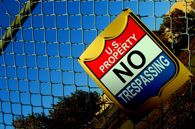
| Should've shown some (more?) of the barbed wire |
|
| Photographer found comment helpful. |
|
|
11/28/2004 11:22:22 AM |
| Like the skewed angle, makes for a more interesting shot of a boring sign. Although, the sign is very colorful. I like the way the top of the fence cuts the corner too. |
|
| Photographer found comment helpful. |
|
|
11/28/2004 07:06:14 AM |
| excelent use of primarys, interesting lines and angle. very cool |
|
| Photographer found comment helpful. |
|
|
11/27/2004 12:09:53 PM |
| Nice but it would be more clearer if the sign was more straight and not crooked but very creative! |
|
| Photographer found comment helpful. |
|
|
11/26/2004 03:39:42 PM |
| awesome vibrant colors. demerits for the dizzying composition angle. |
|
| Photographer found comment helpful. |
|
|
11/26/2004 12:34:57 AM |
| I like the use of the angle here.... makes it considerably more interesting than it would have otherwise been. The over saturation makes the sign look great but the sky is much tooo blue in the top left. |
|
| Photographer found comment helpful. |
|
|
11/25/2004 03:29:47 PM |
|
| Photographer found comment helpful. |
|
|
11/24/2004 08:00:07 PM |
| Excellent Color. Interesting Angle. This is a strong entry in my opinion. |
|
| Photographer found comment helpful. |
|
|
11/24/2004 07:38:17 PM |
| ugh, now I'm dizzy. I think a standard horizon would have worked better |
|
| Photographer found comment helpful. |
|
|
11/24/2004 02:08:14 PM |
| This is another example of the "angle club" I don't see how this angle adds much to the photo, and because of it, I cannot see any of the environment. |
|
| Photographer found comment helpful. |
|
|
11/24/2004 01:20:02 PM |
Yeah, this one's great. Very clear colours, a simple message with an ironic comment in the title. I don't know why, but the rotation's nice, too. Perhaps, sometime, you can teach me why.
I guess I can finally handle out a 10. Well done. |
|
| Photographer found comment helpful. |
|
|
11/24/2004 06:50:43 AM |
| I like the way you gave it a tilt. the colors are nice but imo the shadow on the sign is not really helping. But nice picture. |
|
| Photographer found comment helpful. |
|
|
11/24/2004 05:36:10 AM |
|
| Photographer found comment helpful. |
|
|
11/24/2004 03:30:00 AM |
| Great saturation of colours. |
|
| Photographer found comment helpful. |
|
|
11/24/2004 02:42:39 AM |
| i know someone who used to have one of those signs hanging in their bedroom...he thought it was really cool...can't remember his name (not that it matters, that was a long time ago, when signs didn't seem to carry as much authority as they do today). nice shot, like the angle. good luck! |
|
| Photographer found comment helpful. |
|
|
11/24/2004 01:33:54 AM |
| Interesting angle. I like the saturation, focus, and clarity. |
|
| Photographer found comment helpful. |
|
|
11/24/2004 01:15:01 AM |
| clean image vivid colour i like the shot |
|
| Photographer found comment helpful. |
|
|
11/24/2004 12:27:03 AM |
| Great angle, it gives a dizzying effect which works well with the concept, but I would crop this a little tighter. It seems to be fading off the frame due to the shadow. That takes away from the imposing image the artist was trying to convey, especially since the title makes a dare. I would also shoot the shot from below even more. Let the sign tower over the viewer. |
|
| Photographer found comment helpful. |
Home -
Challenges -
Community -
League -
Photos -
Cameras -
Lenses -
Learn -
Help -
Terms of Use -
Privacy -
Top ^
DPChallenge, and website content and design, Copyright © 2001-2025 Challenging Technologies, LLC.
All digital photo copyrights belong to the photographers and may not be used without permission.
Current Server Time: 03/12/2025 01:58:17 AM EDT.