DPChallenge: A Digital Photography Contest You are not logged in. (log in or register
 
Challenge Entries
Portfolio Images
This image is not part of a public portfolio.
Tybee Light
Tybee Light
ejones


Photograph Information Photographer's Comments
Challenge: Authority (Basic Editing I)
Camera: Canon PowerShot S1 IS
Location: Tybee Island, Georgia
Date: Nov 20, 2004
Date Uploaded: Nov 23, 2004

N/A

Statistics
Place: 70 out of 149
Avg (all users): 4.9818
Avg (commenters): 5.3333
Avg (participants): 4.7722
Avg (non-participants): 5.0663
Views since voting: 803
Views during voting: 369
Votes: 275
Comments: 6
Favorites: 0


Please log in or register to add your comments!

AuthorThread
 Comments Made During the Challenge
11/30/2004 08:02:09 PM
I think ho-hum to the topic but as I don't see much support to the "authority" of the U.S. flag from the "authority" of an even taller light house. Perhaps if we had a U.S. Flag next to some kind of figure or symbol of authority it would come off with more impact.
11/28/2004 08:01:24 AM
nice colors. as for the challenge, it comes across a little more snap-shotty than as a strong image of authority.
11/26/2004 03:44:26 AM
Connection with challenge theme: low, symbolic, concrete, obscure.

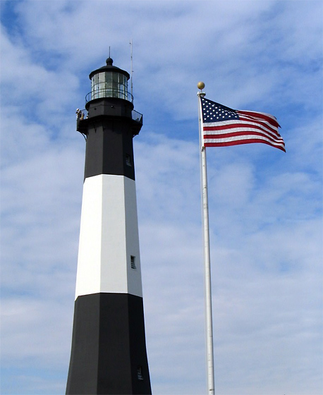
"Ordered by General James Oglethorpe, Governor of the 13th colony, in 1732, the Tybee Island Light Station has been guiding mariners safe entrance into the Savannah River for over 270 years." (www.tybeelighthouse.org). This particular symbolic landmark has implied authority. Unfortunately, 99.935% of viewers will miss the point.

Technical:
(+) points: focus, exposure, tonal range, saturation, detail.
(-) points: nothing overtly glaring.

Artistic: I'm a fan of lighthouses. I wish you had not used this particular angle. Ideally, a lighthouse should be shot from afar at a near horizontal angle with a large telephoto lens, and with an interesting sky/horizon as a backdrop. You cropped off/excluded the bottom of the lighthouse, which is a shame. The flag is quite interesting visually. The sky is rather mundane and adds little to this photo.

Overall: You chose a rather obscure symbolic tie with authority which may not be readily associated by the casual observer. The photograph has technical integrity but points were accordingly taken for the above stated artistic shortcomings.

Recommendations: A different title other than "Tybee Light" may have steered the viewer to make an easier connection with this shot. Other recommendations as stated in the artistic section. Overall I think you chose an interesting subject but it could have been more visually distinctive had you used a different point of view.
11/24/2004 03:44:43 PM
i don't know why i like this really, i would like to see some ground here for reference, perhaps a closer up perspective, but still one of my favorites this week
11/24/2004 01:35:47 AM
The flag is competeing with the lighthouse for being a focal point. they are too close in height, and they are both sharp... If one or the other were less important, I'd like the shot more.
11/24/2004 12:54:18 AM
Such vibrant colors and clean lines; however, the images compete for dominance. I would change the angle and point of view to let one complement the other, and let one take center stage. The lines of the lighthouse and the fact that the flag is blowing toward the right frame gives this image a feeling of power and hope.


Home - Challenges - Community - League - Photos - Cameras - Lenses - Learn - Help - Terms of Use - Privacy - Top ^
DPChallenge, and website content and design, Copyright © 2001-2025 Challenging Technologies, LLC.
All digital photo copyrights belong to the photographers and may not be used without permission.
Current Server Time: 03/12/2025 07:57:35 AM EDT.