| Author | Thread |
Comments Made During the Challenge  |
|
|
11/30/2004 06:19:52 AM |
|
|
|
11/27/2004 05:55:10 PM |
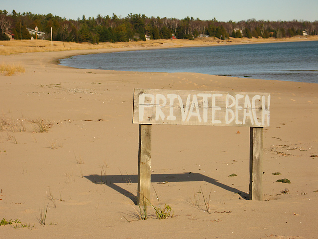
| Its not that interesting spot and colors. I think you should have tried in B&W... could look pretty moody. |
|
|
|
11/26/2004 01:02:49 PM |
| Good idea but that doesn't look like a very desirable beach. |
|
|
|
11/25/2004 05:43:51 AM |
| i don't know what i would do if presented this opportunity. i guess, that, if it wasn't for the authority challenge, i wouldn't be taking a shot of that sign. i bet you had a lot more fun shooting other images, besides this one. if anything, i'd suggest trying for a deeper dof. |
|
|
|
11/24/2004 11:54:12 PM |
| The framing of this photo truly make me feel as if I have walked up to this beach and been stopped cold in my tracks. The harsh light on the sign emphasizes its harsh message. The like the use of space and the only shadow I can really see being the shadow of the sign, hiniting at what lies behind it perhaps? The fact that the sign is slightly angles away, whether intentional by the artist or not, makes me almost feel as though I have to look around it to read it better. This photo works well for me. |
|
 Photographer found comment helpful. Photographer found comment helpful. |
|
|
11/24/2004 01:43:54 AM |
| This image feels alitle lakcing. Colors are a ittle flat, and there is little of interest. |
|
|
|
11/24/2004 01:32:00 AM |
| Good concept but for some reason the photo looks like it was printed in the 60's. It's got a yellowish(?) tint that I don't care for. Don't know if thats the white balance being out of sync or by design. |
|
Home -
Challenges -
Community -
League -
Photos -
Cameras -
Lenses -
Learn -
Help -
Terms of Use -
Privacy -
Top ^
DPChallenge, and website content and design, Copyright © 2001-2025 Challenging Technologies, LLC.
All digital photo copyrights belong to the photographers and may not be used without permission.
Current Server Time: 03/12/2025 09:39:13 AM EDT.