| Author | Thread |
Comments Made During the Challenge  |
|
|
11/30/2004 08:55:10 PM |
returning for comment:
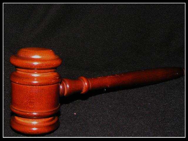
A simple reprensentation and nice fading into dark effect. An aternative would have been holding the gavil and cathing it on impact. Bumping up to 6 |
|
|
|
11/30/2004 06:26:52 AM |
| you have dust and speckles on this photo. looks very funky. |
|
|
|
11/30/2004 03:05:32 AM |
| Nice composition. A bit softer lighting would help this. |
|
|
|
11/28/2004 11:28:26 PM |
| try using velvet for the background. Stuff like that soaks up more light. |
|
|
|
11/28/2004 08:29:15 AM |
| yes, this is a symbol of authority, meeting the challenge. as an image, though, it needs work. the wrinkles in the background are distracting, as are the hotspots on the gavel. if that is dust in the foreground, it shouldn't be there, as is whatever the white spot in the middle. it's a little too tightly cropped, and the lighting is uneven from front to back. if that is your intention, it probably woud have been better with a different angle (try it with the handle goes more to the upper right corner). and, i hope this is not the case, it appears that you have a set of hot pixels on your sensor. |
|
|
|
11/27/2004 03:44:30 AM |
| I think the focus is a little too soft here... but the on the 'bright' side the lighting works well. |
|
|
|
11/26/2004 08:27:00 PM |
| Good concept, spoiled somewhat by noise and glare. |
|
|
|
11/25/2004 12:44:35 PM |
| I wanted to get this same shot. I wonder if you have several variations as the compostion is a bit disturbing. |
|
|
|
11/25/2004 08:21:09 AM |
| I find the strong highlights distracting. |
|
|
|
11/24/2004 01:00:55 PM |
| I'd have liked to see a hand holding that hammer, and a 'swish' as its coming down, like in 'Swish!' by alansfreed. |
|
|
|
11/24/2004 12:49:10 PM |
| This shot comes across as very noisy. Also, the highlight on the gavel is too strong. |
|
|
|
11/24/2004 12:00:30 PM |
| Nice concept. The highlights are really harsh and detract from what you are trying to do. The background seems to be too prominent and I am sure a tweak at the levels would help in making it hide a bit. The speckles of dust really detract from the shot. All that aside, because it is on topic and still gets a 5 from me |
|
|
|
11/24/2004 11:34:47 AM |
| A good idea. I might have given the subject a little more space in the frame so it doesn't look so jammed in. I also would have used a less harsh light- the lighting choice makes this feel like little more than a snapshot. |
|
Home -
Challenges -
Community -
League -
Photos -
Cameras -
Lenses -
Learn -
Help -
Terms of Use -
Privacy -
Top ^
DPChallenge, and website content and design, Copyright © 2001-2025 Challenging Technologies, LLC.
All digital photo copyrights belong to the photographers and may not be used without permission.
Current Server Time: 03/12/2025 08:01:32 AM EDT.