| Author | Thread |
Comments Made During the Challenge  |
|
|
12/07/2004 11:46:09 PM |
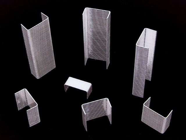
| This would have been even more effective if you could have eliminated the moire. |
|
 Photographer found comment helpful. Photographer found comment helpful. |
|
|
12/07/2004 04:24:59 PM |
| How clever! Were you stuck at the office on the day of the deadline? I was at school after my photographing on the week-end got rained out :( when the deadline for Low Tech came up, hence the scissors in my entry. This has great focus! |
|
| Photographer found comment helpful. |
|
|
12/07/2004 10:07:26 AM |
| A very nice abstract effect created by an everyday object most people would never even think to use in a composition. It's simplicity is it's best feature. Very impressive. The flat black background and lack of shadows works very well here. |
|
| Photographer found comment helpful. |
|
|
12/07/2004 06:33:49 AM |
| Simple and very creative. I like it! |
|
| Photographer found comment helpful. |
|
|
12/06/2004 09:33:09 PM |
| Great concept, Ii like it |
|
| Photographer found comment helpful. |
|
|
12/05/2004 12:59:06 AM |
| Clever idea and well executed. Good Luck! |
|
| Photographer found comment helpful. |
|
|
12/05/2004 12:31:22 AM |
|
| Photographer found comment helpful. |
|
|
12/01/2004 11:41:19 PM |
| Now that's creatively simple, why didn't I think of that. Nice shot, on the middel tower looks like it's getting too much sun (light in this case). Good Job. |
|
| Photographer found comment helpful. |
|
|
12/01/2004 08:18:57 PM |
| good display of moire effect. |
|
|
|
12/01/2004 06:33:25 PM |
|
|
|
12/01/2004 01:23:20 PM |
| Creative! The title cinches the composition and turns ordinary objects into a city skyline of sorts. The interference of the horizontal lines of the staples add a little something to this photo where it might be distracting otherwise. |
|
| Photographer found comment helpful. |
|
|
12/01/2004 10:43:19 AM |
|
| Photographer found comment helpful. |
|
|
12/01/2004 04:30:59 AM |
| I really like the idea for the subject here... the execution however, seems to be lacking just a little something - I think it might be the arrangement of the 'towers' also the one in the middle is kinda blown out which is distracting... but otherwise a great idea. |
|
| Photographer found comment helpful. |
|
|
12/01/2004 02:09:54 AM |
|
| Photographer found comment helpful. |
|
|
12/01/2004 02:01:37 AM |
|
| Photographer found comment helpful. |
|
|
12/01/2004 12:56:51 AM |
| i like the idea, and the thumbnail looked great, but at full size, i'm seeing a lot of moire and what looks like gritty sharpening. maybe this is a severe crop of a much larger image? also, the center staples are almost completely blown out to white. unless that was intentional, i think it takes away from the shot. |
|
| Photographer found comment helpful. |
Home -
Challenges -
Community -
League -
Photos -
Cameras -
Lenses -
Learn -
Help -
Terms of Use -
Privacy -
Top ^
DPChallenge, and website content and design, Copyright © 2001-2025 Challenging Technologies, LLC.
All digital photo copyrights belong to the photographers and may not be used without permission.
Current Server Time: 03/15/2025 06:49:53 PM EDT.