| Author | Thread |
Comments Made During the Challenge  |
|
|
12/05/2004 12:31:15 PM |
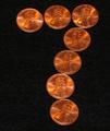
| I would suggest softer light to avoid the specular highlight. Good Work. |
|
|
|
12/04/2004 11:06:25 AM |
| nice layout - a bit on the grainey side |
|
|
|
12/03/2004 09:34:18 PM |
| Very nice. If you could have shot it so that there were no shadows it would have been amazing. Great idea and nice execution. |
|
|
|
12/02/2004 05:03:53 PM |
| I really like the idea behind this photo. Just a couple of small things let it down IMHO. 1st is the marks on the background, they are very distracting. 2nd is the 2 coins that are flipped, because its only 2 and on the same side it has unbalanced to photo for me. Great lighting and colours. |
|
|
|
12/01/2004 08:27:21 PM |
| The spots on the background should have been cloned out. |
|
|
|
12/01/2004 06:15:24 PM |
|
|
|
12/01/2004 03:21:39 PM |
|
|
|
12/01/2004 10:20:06 AM |
| a little grainy, is that dust in the corners? It sure distracts |
|
|
|
12/01/2004 06:22:58 AM |
|
|
|
12/01/2004 03:22:57 AM |
| nice comp, but irritating fibers/dust on background. |
|
|
|
12/01/2004 02:03:58 AM |
| Too bad for a basic editing challenge - the background is asking to have the white spots cloned out. |
|
Home -
Challenges -
Community -
League -
Photos -
Cameras -
Lenses -
Learn -
Help -
Terms of Use -
Privacy -
Top ^
DPChallenge, and website content and design, Copyright © 2001-2025 Challenging Technologies, LLC.
All digital photo copyrights belong to the photographers and may not be used without permission.
Current Server Time: 04/17/2025 08:24:13 PM EDT.