| Author | Thread |
Comments Made During the Challenge  |
|
|
12/05/2004 06:25:09 AM |
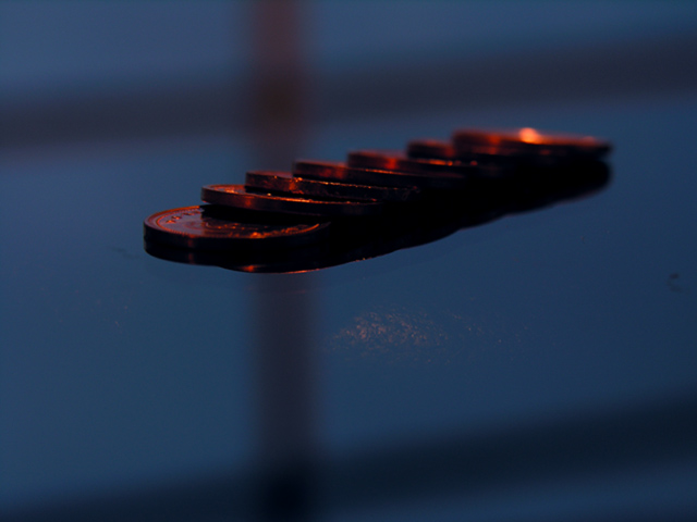
| This is a bit dark on my monitor (which could just be my monitor) |
|
|
|
12/04/2004 04:30:52 PM |
| The best coin shot I have seen so far. The colors are nice and the composition is decent. I would have tried a slightly higher viewpoint. -6 |
|
|
|
12/04/2004 12:56:04 PM |
| I wonder how you got the effect that it looks like flying. Colors are pretty interesting too but would like bit different angle to see more of coins. |
|
|
|
12/03/2004 09:37:34 PM |
| the brown smudge is destracting |
|
|
|
12/02/2004 07:26:47 AM |
| I think the coins are too dark, but I like the contrast of the colors and the surface they're on. |
|
|
|
12/02/2004 12:44:19 AM |
| Would have like to have seen this on a very light reflective surface to show pennys in reflection..kind of on the dark side. |
|
|
|
12/01/2004 08:20:56 PM |
|
|
|
12/01/2004 06:08:23 PM |
| Nice idea, but just doesn't work for me. The window frame shadow on the whole photo is distracting and takes away from the subject. Also I see a discolorization in the middle below the pennies and I'm not sure what it is. |
|
|
|
12/01/2004 12:49:18 PM |
| I really like this photo. I think it maybe a little to dark. |
|
|
|
12/01/2004 11:46:22 AM |
|
|
|
12/01/2004 11:44:08 AM |
| too dark and not enough detail. the criss-crossing lines are distracting |
|
|
|
12/01/2004 10:20:38 AM |
| interesting... but won't score well because it's too dark. |
|
|
|
12/01/2004 08:42:11 AM |
| interesting effect, but wish the surface could be fixed with cloning/healing here. |
|
|
|
12/01/2004 02:01:59 AM |
| I like everything about this photo -- metallic on metallic, colors are great, and the gridded background shadows add complexity and aren't overly symmetrical. Nice job! |
|
|
|
12/01/2004 01:03:19 AM |
| Good subject, reasonable comp. I think the colors would be good but they need brightening up IMO. |
|
|
|
12/01/2004 12:18:15 AM |
| They seem to be floating...neat! |
|
Home -
Challenges -
Community -
League -
Photos -
Cameras -
Lenses -
Learn -
Help -
Terms of Use -
Privacy -
Top ^
DPChallenge, and website content and design, Copyright © 2001-2025 Challenging Technologies, LLC.
All digital photo copyrights belong to the photographers and may not be used without permission.
Current Server Time: 03/12/2025 01:43:59 PM EDT.