| Author | Thread |
|
|
12/13/2004 06:26:02 AM |
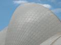
| Man I was 100% sure most people would dislike the branches and find them cluttering/distracting, thats why I told you I love them ;) I think they add a really nice touch to the photo and makes it more interesting to look at. It should have done way better IMO! |
|
 Photographer found comment helpful. Photographer found comment helpful. |
Comments Made During the Challenge  |
|
|
12/12/2004 11:50:13 PM |
| It's a good landmark, but too much clutter in front that hides it. |
|
| Photographer found comment helpful. |
|
|
12/12/2004 09:59:45 PM |
| Glad to see other people including trees in their building shots -- I like them there myself ... |
|
| Photographer found comment helpful. |
|
|
12/11/2004 12:03:30 PM |
| This is nice but the trees in the foreground are a little too overbearing. 6. |
|
| Photographer found comment helpful. |
|
|
12/10/2004 10:59:02 PM |
| Color would have really improved this photo. |
|
| Photographer found comment helpful. |
|
|
12/09/2004 01:09:57 AM |
| I knock down other photos with trees in the front of the photo but for yours it seems like it works for some reason. Maybe because the top is exposed or because it seems clearer. Good job. |
|
| Photographer found comment helpful. |
|
|
12/08/2004 07:09:38 PM |
| Classical, neatly organised - filling the negative space with trees is always effective, and makes a useful lead into the top of the dome. Clever composition, and strong sense of plasticity in the dome itself. |
|
| Photographer found comment helpful. |
|
|
12/08/2004 03:33:49 PM |
| Very nice use of framing with both trees. The cold effect is beautiful. |
|
| Photographer found comment helpful. |
|
|
12/08/2004 11:36:24 AM |
| I think the trees take away from the shot, otherwise, very nice |
|
| Photographer found comment helpful. |
|
|
12/06/2004 10:15:18 PM |
| I really like the idea here. I like having the trees there, but they really almost seem to overwhelm the focus on the building imo. Still, one of the better shots I"ve seen. |
|
| Photographer found comment helpful. |
|
|
12/06/2004 05:53:24 PM |
| The branches are very distracting. the light on the left side of the building is very bright, thats my opinion. If this didn't have the branches it would be a very nice photo, but that doesn't mean it's not good i like it. this is my opinion. |
|
| Photographer found comment helpful. |
|
|
12/06/2004 03:23:10 AM |
| Nice use of greyscale. The trees clutter your main image, obscuring it too much. |
|
| Photographer found comment helpful. |
|
|
12/06/2004 12:55:51 AM |
| I love the soft tone and how the branches cover the state house... |
|
| Photographer found comment helpful. |
|
|
12/06/2004 12:50:39 AM |
| the grayscale is lacking alittle, but nice overall shot |
|
| Photographer found comment helpful. |
Home -
Challenges -
Community -
League -
Photos -
Cameras -
Lenses -
Learn -
Help -
Terms of Use -
Privacy -
Top ^
DPChallenge, and website content and design, Copyright © 2001-2025 Challenging Technologies, LLC.
All digital photo copyrights belong to the photographers and may not be used without permission.
Current Server Time: 03/15/2025 12:38:51 AM EDT.