| Author | Thread |
Comments Made During the Challenge  |
|
|
12/12/2004 10:30:23 PM |
|
 Photographer found comment helpful. Photographer found comment helpful. |
|
|
12/12/2004 12:24:21 AM |
| Interesting use of negative space and color. 5. |
|
| Photographer found comment helpful. |
|
|
12/11/2004 12:42:54 PM |
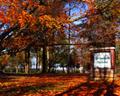
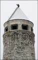
| I think this is beautifully shot and very interesting composition. But there is something that disturbs me about it. Maybe that's what you were trying to do. Perhaps there is just too much sky. |
|
| Photographer found comment helpful. |
|
|
12/11/2004 03:13:15 AM |
| I like the composition. I have no clue what your subject is, but the power company is to be commended on the location of that power pole. |
|
| Photographer found comment helpful. |
|
|
12/10/2004 11:56:15 AM |
| I like the minimalist composition |
|
| Photographer found comment helpful. |
|
|
12/10/2004 10:20:43 AM |
| This doesn't even look real, nice contrast of the the gray against the huge blue sky. |
|
| Photographer found comment helpful. |
|
|
12/09/2004 05:01:45 PM |
| the cross is too small. I like the placement and the concept otherwise. |
|
| Photographer found comment helpful. |
|
|
12/09/2004 12:23:57 AM |
| Really like the use of negative space and the shadows here, it's a great subject for a shot like this. 8. |
|
| Photographer found comment helpful. |
|
|
12/07/2004 01:00:44 AM |
| I don't like the composition at all. I don't get it. |
|
|
|
12/06/2004 06:26:53 PM |
| I really like this one! The subject in the lower left with the big sky works well. I wish we could get just the slightest glimpse of what the monument is standing on so we could have a better idea of its size -- whether it's 2 inches tall or hundreds of feet -- but maybe that would ruin its simplicity. Anyway, I'm rambling. What's important is this one captivated me and had me staring at my screen for a long time trying to figure it out. This one gets a solid 9. |
|
| Photographer found comment helpful. |
|
|
12/06/2004 03:53:18 PM |
| There are things I like about your concept, but I the placement leaves me unsatisfied. I think that the colors are stunning and the lighting adds a great deal to this, but I need it to fill more of the frame. |
|
| Photographer found comment helpful. |
|
|
12/06/2004 08:49:44 AM |
| The negative space on this one just doesn't appeal to me. I think the technical aspects are done well...I just don't find the subject and composition appealing. |
|
| Photographer found comment helpful. |
Home -
Challenges -
Community -
League -
Photos -
Cameras -
Lenses -
Learn -
Help -
Terms of Use -
Privacy -
Top ^
DPChallenge, and website content and design, Copyright © 2001-2025 Challenging Technologies, LLC.
All digital photo copyrights belong to the photographers and may not be used without permission.
Current Server Time: 03/12/2025 02:41:20 PM EDT.