| Author | Thread |
Comments Made During the Challenge  |
|
|
02/23/2003 02:27:21 PM |
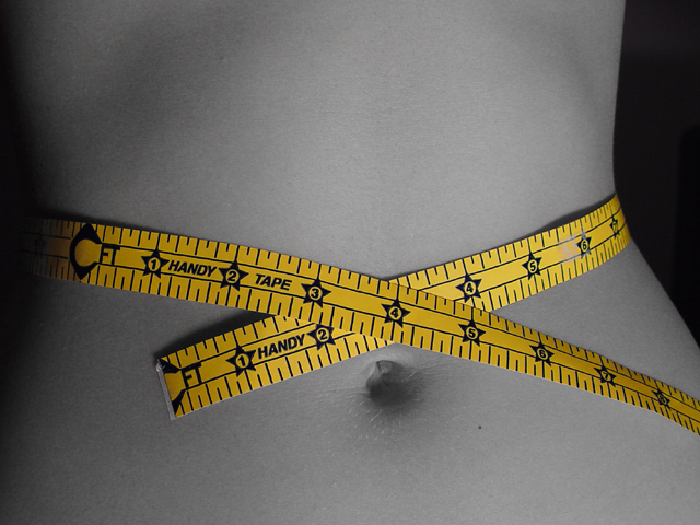
Nice composition - position of belly button, curve of waist and measuring tape are all just right.
A little grainy and dark at left.
7, Kavey |
|
|
|
02/23/2003 01:36:05 PM |
| Cool concept, the tape really punches up this shot. Composition is right on. |
|
 Photographer found comment helpful. Photographer found comment helpful. |
|
|
02/23/2003 01:16:21 PM |
| Nice image, but for the life of me, I can't figureout what her waist size is!! Idon't understand your measuring tape. How did you get this to desaturate flesh tones without affecting the yellow of the tape? I've tried this technique and I've had a hard time separating fleshtones from yellows. Great job, nice image and good luck in the challenge. 8 |
|
| Photographer found comment helpful. |
|
|
02/22/2003 07:26:01 PM |
| Very nice stomach but im not familiar with such a measuring tape. These is a small mess up on the tape near the 6. but you get an 8. |
|
| Photographer found comment helpful. |
|
|
02/22/2003 06:41:27 PM |
One of my two favourites.The mochrome vs yellow works great and the measure lint (don't know if that is the right English word) works great on the body profile and is nicely positioned above the belly button.
|
|
| Photographer found comment helpful. |
|
|
02/22/2003 06:11:02 AM |
| Great photo, very nice composition, and with only yellow left in the photo, it gives a nice effect. 10 |
|
| Photographer found comment helpful. |
|
|
02/22/2003 05:29:04 AM |
| beautiful lighting and shadows. great work! |
|
| Photographer found comment helpful. |
|
|
02/21/2003 10:01:50 PM |
| Bold, original idea that works for me. The theme is clearly yellow, and I like the composition. Have you tried fiddling with the light so that there is more dark, especially on the left side of the photo? That may create more contrast and more interest. Very cool work. |
|
| Photographer found comment helpful. |
|
|
02/21/2003 09:34:24 PM |
| I like the way you used the B & W colors for the body. Great composition! |
|
| Photographer found comment helpful. |
|
|
02/20/2003 04:30:00 AM |
| Excellent shot. Love how you have saturated the colour to B&W leaving the main colour intact. Composition is very interesting and this shot caught my eye because your image is different and very creative. Overall an excellent shot showing the colour yellow. GL |
|
| Photographer found comment helpful. |
|
|
02/19/2003 11:28:44 PM |
| Awesome shot, I love the colors and the clarity of focus. One of my favorites. |
|
|
|
02/19/2003 09:47:39 PM |
| Perfect belly button also. :) |
|
|
|
02/19/2003 01:27:58 PM |
| Seems a little over sharpened? The measures seem a little 'stepped', not quite sure why. Excellent pic nevertheless. 8 |
|
| Photographer found comment helpful. |
|
|
02/19/2003 12:19:00 PM |
| excellent shot :) the cross pattern of the yellow tape on the desaturated body stands out very well in this shot... great work :) = 10 - setzler |
|
| Photographer found comment helpful. |
|
|
02/19/2003 05:43:00 AM |
| I would love to know how to take this! I love this image, and I have no idea how? With photoshop, right? Great shot! |
|
| Photographer found comment helpful. |
|
|
02/18/2003 11:29:53 PM |
| really neat shot! normally, i don't like the "desaturate all but one color channel" shots, but it fits perfectly for this theme, and probably even this pic (though i'd like to see the original in color, too). very nice job |
|
| Photographer found comment helpful. |
|
|
02/18/2003 12:42:05 PM |
| This is probably the most effective use of desaturation in the entire challenge. Very sharp focus where it should be sharp and a nice tie-in with the title of the photo. Lighting is excellent. |
|
| Photographer found comment helpful. |
|
|
02/18/2003 06:30:07 AM |
| I saw the same kind of photo as this in a stock photo catalogue only last week, but I must say your version is better by far. The lighting is optimal here. When I look at this my head wants to lean to the left for some reason. I now the subject is standing straight but you have given the illusion of her leaning to the left of the photo. The only thing that distracts me a little is the gray area next to the number 6. Great job, Kiwi = 10! |
|
| Photographer found comment helpful. |
|
|
02/17/2003 09:44:50 PM |
| Nicely done... contrast is great! |
|
| Photographer found comment helpful. |
|
|
02/17/2003 06:44:06 PM |
|
|
|
02/17/2003 09:45:08 AM |
|
|
|
02/17/2003 01:17:59 AM |
| i'm sorry, but what is the real measurement here? |
|
|
|
02/17/2003 12:34:28 AM |
| Very creative I like how the yellow really stands out. Good Luck! |
|
| Photographer found comment helpful. |
|
|
02/17/2003 12:30:16 AM |
| Tone and lighting are perfect. Your off center crop with the tailing tape off the edge of the frame lead the eye through the frame nicely. Well done! |
|
| Photographer found comment helpful. |
Home -
Challenges -
Community -
League -
Photos -
Cameras -
Lenses -
Learn -
Help -
Terms of Use -
Privacy -
Top ^
DPChallenge, and website content and design, Copyright © 2001-2025 Challenging Technologies, LLC.
All digital photo copyrights belong to the photographers and may not be used without permission.
Current Server Time: 03/12/2025 02:54:59 PM EDT.