| Author | Thread |
Comments Made During the Challenge  |
|
|
12/14/2004 08:43:45 PM |
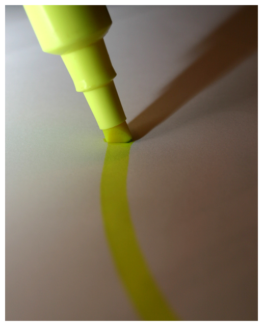
| good title. the photo is not so interesting and since it does not spark my interest I have no suggestions on how to do it better. On a technical note: you could try to set the WB on your camera to the paper (to effectively remove it - or at least that's what I think will happen) and a second lightsource to the L and Down to remove the darker L side. Good luck. /5 for meeting the challenge. |
|
|
|
12/14/2004 04:37:50 PM |
| Feel this is a little to dark just, I would add a little more light on the llne.(4) |
|
|
|
12/13/2004 03:38:53 PM |
| why did you mute the yellow? It needed to pop for the title to make sense. |
|
|
|
12/12/2004 12:45:23 PM |
| Lighting seems a bit dull in the lower part. The idea and the title are good. |
|
|
|
12/10/2004 06:27:37 PM |
| I like how the composition forms the letter "Y" (as in yellow) |
|
 Photographer found comment helpful. Photographer found comment helpful. |
|
|
12/09/2004 11:03:33 PM |
| Nice composition...I would have liked to seen stronger lighting to really bring out the yellow on the paper. Seems a little dull under the lighting you have chosen. |
|
| Photographer found comment helpful. |
|
|
12/09/2004 02:47:07 PM |
| I would have liked this a little brighter. Good idea for the topic. |
|
| Photographer found comment helpful. |
|
|
12/09/2004 09:11:19 AM |
| Lacking a little in interest I think. That is why I did not give as good a score as som others. |
|
| Photographer found comment helpful. |
|
|
12/09/2004 04:47:17 AM |
| Meets the spirit of the challenge nicely. 7 |
|
| Photographer found comment helpful. |
|
|
12/09/2004 03:40:41 AM |
|
| Photographer found comment helpful. |
|
|
12/08/2004 08:26:18 PM |
| There is a lot of good aspects to this shot - if I had to suggest one change it would be to have some text being highlighted since it is a highlighter. Maybe a famous quote or something - would tie it to the title. Ok, one more thing - a little sharper. Good job though. |
|
| Photographer found comment helpful. |
|
|
12/08/2004 02:06:10 PM |
| Nice composition, nice color. I think the paper gets too dark in the lower right-hand corner. |
|
| Photographer found comment helpful. |
|
|
12/08/2004 12:51:10 PM |
| i think this is a good idea and good composition i just think it lacks the good lighting to really bring out the yellow on the paper and eliminate the shadow which darkens this shot, also a highlighter is brighter on glossier paper which may help |
|
| Photographer found comment helpful. |
|
|
12/08/2004 10:07:44 AM |
| to dark..stroke brilliance...brilliance=bright idea |
|
| Photographer found comment helpful. |
Home -
Challenges -
Community -
League -
Photos -
Cameras -
Lenses -
Learn -
Help -
Terms of Use -
Privacy -
Top ^
DPChallenge, and website content and design, Copyright © 2001-2025 Challenging Technologies, LLC.
All digital photo copyrights belong to the photographers and may not be used without permission.
Current Server Time: 03/12/2025 07:30:05 AM EDT.