| Author | Thread |
Comments Made During the Challenge  |
|
|
12/14/2004 10:15:20 PM |
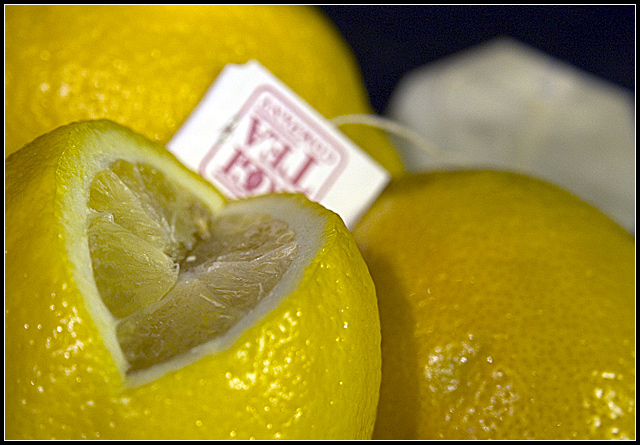
| Personally, I think it would have been better without the teabag. 6 |
|
|
|
12/14/2004 03:45:54 AM |
| the yellow didn't come out ... kind of dull. need more light and white balance. |
|
|
|
12/13/2004 10:21:07 AM |
|
|
|
12/09/2004 06:56:48 PM |
| Yes, this fits the challenge theme nicely! 7 |
|
|
|
12/09/2004 03:38:15 AM |
mmm.... the blurry teabag paper thing becomes the focal point for me, which is kind of painful to look at. blurry text as a focal point is not good!
i think this image could have worked much better if there were something else there. the line of the cut in the lemon leads right to that spot, so it really does make for a strong focal point. hMmMmM. |
|
|
|
12/09/2004 01:44:29 AM |
It took a moment for me to see that you're trying to show a heart shape with the cut lemon - or at least I think that was your intent?
Maybe adding more DOF so that the tea bag tag was in focus would have improved this. Still, a creative entry =) |
|
|
|
12/09/2004 01:31:50 AM |
| The reflection of the flash (lamps) soils this good picture. Good luck! |
|
|
|
12/08/2004 08:56:45 PM |
|
|
|
12/08/2004 08:50:24 PM |
| I think that it would have been best to focus on the lemons,,,, the tea tag is a bit of a distraction, taking away from the strong flow of the yellow lemons. |
|
|
|
12/08/2004 12:12:30 AM |
| I would have liked this wiithout the out of focus tea bag. A 5 |
|
Home -
Challenges -
Community -
League -
Photos -
Cameras -
Lenses -
Learn -
Help -
Terms of Use -
Privacy -
Top ^
DPChallenge, and website content and design, Copyright © 2001-2025 Challenging Technologies, LLC.
All digital photo copyrights belong to the photographers and may not be used without permission.
Current Server Time: 03/11/2025 01:43:34 PM EDT.