| Author | Thread |
|
|
12/15/2004 12:48:00 AM |
| Very nice, should have done better though ;) |
|
 Photographer found comment helpful. Photographer found comment helpful. |
Comments Made During the Challenge  |
|
|
12/14/2004 12:41:13 PM |
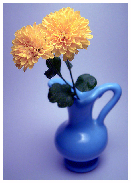
The composition here is pretty strong and I like the effect of the shallow dof and except for that brigt spot on the vase the lighting is very good. However there seems to be a strong blue (cold) color cast over the image. A coldness that I would not expect from such flowers. Cure for the blues (at first I didn't notice the title)?
For me the cure was a grey point sample curve on the background. It resulted in this:
//www.pbase.com/image/37383216 On this edited version the yellow and green seems more natural and the flowers stand out a lot more. On the other hand my grey bg is a bit dull, so outside dpc I might blend in some of the original blue again for the background only.
My main interest: I love it how the flowers stand out dof-wise and the composition with such a classic simple but pretty vase. I hope you do well. |
|
| Photographer found comment helpful. |
|
|
12/13/2004 11:39:36 AM |
| I am in Blues! Give me Yellow......O....O... |
|
|
|
12/12/2004 03:28:17 PM |
|
| Photographer found comment helpful. |
|
|
12/12/2004 08:06:41 AM |
| Great colors and a beautiful subject for this challenge. I like shallow DOF shots to emphasize the subject, but I think this particular shot would actually look better with everything in focus. Regardless, the shot came out great and looks absolutely beautiful. Very nice job! |
|
| Photographer found comment helpful. |
|
|
12/11/2004 05:26:46 PM |
| I like the colors and composition, but especially your choice for dof. Very nice. |
|
| Photographer found comment helpful. |
|
|
12/09/2004 10:03:05 PM |
| I dunno if I really like the effect of the vase being blurred out... |
|
|
|
12/09/2004 09:06:20 PM |
| I am a great complainer about poor use of DOF - this is the poster pic for HOW to use it CORRECTLY. +2 on the score for that alone! Oh, hell. 10. |
|
| Photographer found comment helpful. |
|
|
12/08/2004 09:45:30 PM |
| I love the vase and background with the blurring and the soft light. The border is distracting though. |
|
| Photographer found comment helpful. |
|
|
12/08/2004 06:30:36 PM |
| Like the use of colour and shapes here. Well balanced composition with a nice flow to the whole image. Great job. |
|
| Photographer found comment helpful. |
|
|
12/08/2004 06:18:50 PM |
| oh so pale - the colors are wonderful together |
|
| Photographer found comment helpful. |
|
|
12/08/2004 03:48:00 PM |
love the shallow depth. lighting is almost perfect as well you maybe could have used a diffuser to lessen the reflection on the vase, but other than that it's fab. better perspective than most of the flower shots as well.
P-ness |
|
| Photographer found comment helpful. |
|
|
12/08/2004 05:10:20 AM |
| Nice composition but the yellows are very washed out. |
|
| Photographer found comment helpful. |
|
|
12/08/2004 12:33:03 AM |
| Nice image. I like the soft focus on the vase and the color of the background. Very pleasing to look at. Everything about this draws my eye to your focal point the flowers. Nice job of showcasing your image. |
|
| Photographer found comment helpful. |
Home -
Challenges -
Community -
League -
Photos -
Cameras -
Lenses -
Learn -
Help -
Terms of Use -
Privacy -
Top ^
DPChallenge, and website content and design, Copyright © 2001-2025 Challenging Technologies, LLC.
All digital photo copyrights belong to the photographers and may not be used without permission.
Current Server Time: 03/12/2025 02:46:57 AM EDT.