| Author | Thread |
|
|
12/25/2004 11:55:33 PM |
Greetings from the Critique Club,
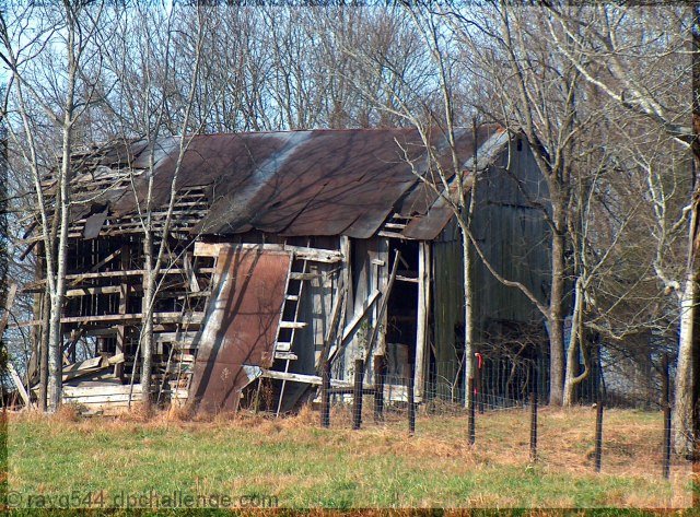
This was a good subject for this challenge but the colors appear a little flat and could have been improved with a little saturation. I don�t think that the border adds anything to the image but that is just my personal taste.
Composition wise the image is a little dull and perhaps if it was shot from further to the right you could have used the fence line as a leading line also if you stood further away so we could see more of shed in it�s environment. There is also something bright red in color on the right side of the shed that is distracting.
I notice that the sun is low in the sky, which is good, but maybe for added impact you could have shot it earlier in the morning or later in the afternoon.
Overall the image is a little bland but didn�t need much work to get a much better outcome.
Good luck in future challenges
Regards
Tim Sturt
|
|
 Photographer found comment helpful. Photographer found comment helpful. |
Comments Made During the Challenge  |
|
|
12/18/2004 06:19:28 PM |
| The border adds nothing. The light is flat. The colors are blah. It's all subject, no art. |
|
|
|
12/16/2004 07:29:19 PM |
| nice idea for this challenge ! |
|
| Photographer found comment helpful. |
|
|
12/14/2004 09:58:02 PM |
| It's somewhat lacking in impact... there's no significant feature to draw the eye in. Colors and levels are good though. |
|
| Photographer found comment helpful. |
|
|
12/14/2004 04:41:38 AM |
| Composition: 7, Technical: 7, Appeal: 8, Challenge: 6, Overall Score: 7 (weighted) |
|
| Photographer found comment helpful. |
|
|
12/13/2004 08:57:05 PM |
|
Home -
Challenges -
Community -
League -
Photos -
Cameras -
Lenses -
Learn -
Help -
Terms of Use -
Privacy -
Top ^
DPChallenge, and website content and design, Copyright © 2001-2025 Challenging Technologies, LLC.
All digital photo copyrights belong to the photographers and may not be used without permission.
Current Server Time: 03/13/2025 08:24:55 PM EDT.