| Author | Thread |
Comments Made During the Challenge  |
|
|
12/17/2004 04:58:20 PM |
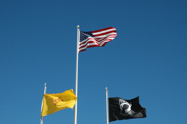
| Shows unity, very American! |
|
|
|
12/16/2004 12:14:22 AM |
| I think this would have been better taken as portrait rather than landscape. The lower flags are too close to the edge of the frame. Color and focus are good. 5. |
|
 Photographer found comment helpful. Photographer found comment helpful. |
|
|
12/16/2004 12:01:14 AM |
| I think I would have cropped the image much tighter from the sides to get rid of some of the negative space. At the same time, I would have liked to have seen just a little more of the flagpoles of the lower two flags. |
|
| Photographer found comment helpful. |
|
|
12/15/2004 02:52:16 AM |
Composition: 5, Technical: 6, Appeal: 4, Challenge: 5, Overall Calculated Average Score: 5
I don't care for the horizontal crop you have here. A verical crop may have really focused the attention onto the flags without so much emptiness. |
|
| Photographer found comment helpful. |
Home -
Challenges -
Community -
League -
Photos -
Cameras -
Lenses -
Learn -
Help -
Terms of Use -
Privacy -
Top ^
DPChallenge, and website content and design, Copyright © 2001-2025 Challenging Technologies, LLC.
All digital photo copyrights belong to the photographers and may not be used without permission.
Current Server Time: 03/12/2025 08:06:02 AM EDT.