| Author | Thread |
Comments Made During the Challenge  |
|
|
12/19/2004 09:01:32 PM |
|
|
|
12/19/2004 08:12:17 PM |
| That one's even more shredded than the one I've been shooting. |
|
|
|
12/19/2004 02:23:37 AM |
| great find, but i would've still liked to have seen the flag in its original colors. |
|
|
|
12/18/2004 08:46:39 PM |
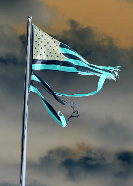
| Broken colouration too, is that it? A technically fine shot, although I have a resistance to the subject matter which won't cost you anything - but I have a stronger resistance to the wacky colouring: it makes the flag an unfamiliar thing, and yet your title suggests that it should be an immediately familiar one. Maybe the impression of confusion is one you wanted to sow, but to my mind it is incoherent. |
|
 Photographer found comment helpful. Photographer found comment helpful. |
|
|
12/18/2004 07:37:28 PM |
| I get the feeling I'd love this if the colors were natural; as a negative image it doesn't work for me. |
|
|
|
12/16/2004 04:29:51 PM |
| I like the surreal quality...pretty insane. |
|
|
|
12/15/2004 09:44:15 PM |
Returning for comments:
Reversed colors to give the image a real eerie feel of triumph. 7 |
|
| Photographer found comment helpful. |
|
|
12/15/2004 01:01:11 PM |
| I'm not sure I get the point of the negative coloring. |
|
|
|
12/14/2004 04:06:50 PM |
| Inverted colors aren't doing it for me... |
|
|
|
12/14/2004 06:37:40 AM |
unhelpful comment removed.
Message edited by author 2005-10-05 06:23:54. |
|
|
|
12/14/2004 01:41:45 AM |
| The color shift does not work for me. Creative interpretation though. |
|
| Photographer found comment helpful. |
|
|
12/13/2004 08:49:40 PM |
|
|
|
12/13/2004 08:45:22 PM |
| I think you have a great photo here but the post shot adustments (or infrared filter)dont work for me. I think this would be much more of a shot if the flag was normal color. |
|
| Photographer found comment helpful. |
|
|
12/13/2004 07:03:07 PM |
I never have and never will truly appreciate shots that are treated with this type of psychedelic coloring...
TC |
|
|
|
12/13/2004 02:05:52 PM |
| I think the photo would have been more effective withtout the color inversion. |
|
| Photographer found comment helpful. |
|
|
12/13/2004 12:52:39 PM |
I would have loved to have seen this in it's natural colours...I think it could have been a great shot!
The focus, the clouds, the moment, the message and the subject all added up to a 10 photo.
The angled flag pole and the post-processing have reduced that significantly...I give it a 6...I can't wait to see the original! |
|
| Photographer found comment helpful. |
|
|
12/13/2004 03:42:45 AM |
| The flag is a nice shape, good sky. Why are you inverting the image and using this title? What are you trying to say? Is this an effective way to get your message across? |
|
|
|
12/13/2004 01:29:59 AM |
| Bold entry. Palette shift creates a stark image which conveys your point nicely, albeit a dark theme. |
|
| Photographer found comment helpful. |
|
|
12/13/2004 12:40:46 AM |
| Would have had more of an impact (to me) if you left the flag RW&B. I like the sky in the background but find the saturation of the flag will cause you some higher votes. Still gave a 5 based on the composition (7 if flag was untouched). Would like to see a copy with the flag untouched. |
|
| Photographer found comment helpful. |
Home -
Challenges -
Community -
League -
Photos -
Cameras -
Lenses -
Learn -
Help -
Terms of Use -
Privacy -
Top ^
DPChallenge, and website content and design, Copyright © 2001-2025 Challenging Technologies, LLC.
All digital photo copyrights belong to the photographers and may not be used without permission.
Current Server Time: 03/12/2025 02:35:50 PM EDT.