In its conception, this is a lovely image. But I'm going to stick my neck out, hoping you won't mind, regarding a few ways it's not living up to its potential:
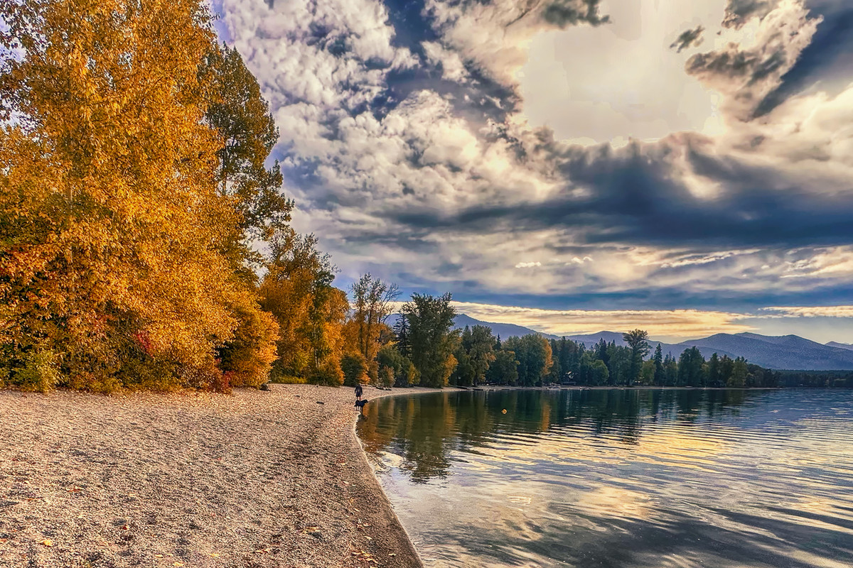
1. The image feels badly skewed, giving the whole an unbalanced air. I realize you went to the trouble of leveling the shoreline itself, but my eyes KNOW that's supposed to be a receding shoreline so I find myself slamming hard against it. The mountaintops in the distance would have worked for you as a natural level...
2. The figure and the dog WANT to be an intermediate focal point and my eyes are TRYING to go there but they just are not quite prominent enough, and they become almost a flaw, an eye-trap.
3. The mass of pebbly beach filling the lower-left quadrant of the image is far too big and featureless, and it's denaturing the otherwise quite entrancing mixture of color and light you have to work with. I suspect that had you ambled another 30 feet towards the figures and pointed the camera a bit more upwards, the composition as a whole would be much more harmonious...
4. Finally, you quite rightly took a stab at toning down a very large, very bright sunhole in the upper left, but the execution isn't up to par. I don't know if you can see it on your monitor, but you've filled the whole with blocky gray shapes that are entirely artificial. There are much better ways to accomplish what you set out to do.
I obviously don't know who you are as I write this, but if you find this criticism too harsh and want it gone (some people do feel that way) then let me know via PM and I'll delete it immediately, OK? Contrariwise, if you want some mentoring on landscape photography, and processing, I'd be happy to work on that with you.
Robt. |