| Author | Thread |
|
|
08/14/2005 04:13:32 PM |
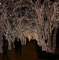
Well, no one can compete the original work and Remie is a wonderful artist, but yours is great just as well, and I am more then proud to share the same thought with you on this pic.
|
|
 Photographer found comment helpful. Photographer found comment helpful. |
|
|
12/27/2004 10:36:13 AM |
| Hey Peter: this will always remain an impressive image. A very good rendering. |
|
| Photographer found comment helpful. |
Comments Made During the Challenge  |
|
|
12/26/2004 04:40:02 PM |
| Very neat with textures and colors that sing from the heavens. Bumping up. |
|
| Photographer found comment helpful. |
|
|
12/23/2004 09:00:10 PM |
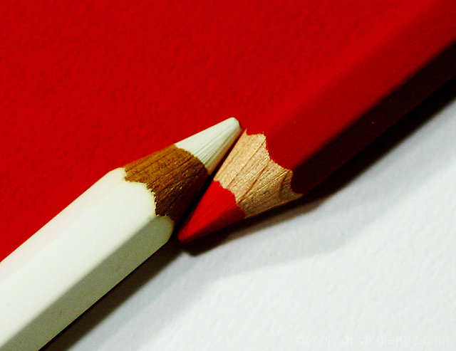
| the pencils aren't sharp enough. Also they are not aligned well...they dont' seem to be in a straight line |
|
| Photographer found comment helpful. |
|
|
12/23/2004 09:37:36 AM |
| Another excellent chance for a side-by-side comparison. This is an excellent tribute to Remie's original. I get the sense that your lights were not quite as powerful as his (maybe trying to avoid blowing out the whites?). The result is that your reds are not quite as vibrant either, but it's still an excellent photo, and one you should be proud of. 7. |
|
| Photographer found comment helpful. |
|
|
12/22/2004 04:52:54 PM |
| I know this sounds silly, but the pointed end of your pencils is too short/steep. the shadow in front is a distraction as well. |
|
| Photographer found comment helpful. |
|
|
12/22/2004 12:46:35 PM |
| somethign about this seems a hair too soft, but nice work. |
|
| Photographer found comment helpful. |
|
|
12/22/2004 10:44:30 AM |
| This has a simplicity that works. |
|
| Photographer found comment helpful. |
|
|
12/21/2004 11:47:03 PM |
| Love the graininess in this. Gives it a real "canvas / arty" look. Focus on the pencil tips seems a little too soft though? 8. |
|
| Photographer found comment helpful. |
|
|
12/21/2004 11:35:19 AM |
|
| Photographer found comment helpful. |
|
|
12/21/2004 08:47:48 AM |
| good choice, simple & effective! |
|
| Photographer found comment helpful. |
|
|
12/20/2004 12:17:56 PM |
| I like the way this differs from the original. Nicely done. |
|
| Photographer found comment helpful. |
|
|
12/20/2004 09:34:35 AM |
| In amny senses this is a wild improvement on the original, which actually suffers from big technical problems. What you don't have, for me, is the big bright punchy over-exposed feeling (good thing? bad thing? don't know), and this to my eye suffers a bit for that - in a way it's too realistic this, rather than having the disgned edge of the original. As a variation - well, the set-up itself is so very designed, that I'm not certain of the benefits of this approach. |
|
| Photographer found comment helpful. |
Home -
Challenges -
Community -
League -
Photos -
Cameras -
Lenses -
Learn -
Help -
Terms of Use -
Privacy -
Top ^
DPChallenge, and website content and design, Copyright © 2001-2025 Challenging Technologies, LLC.
All digital photo copyrights belong to the photographers and may not be used without permission.
Current Server Time: 03/10/2025 07:00:40 PM EDT.