***CRITIQUE CLUB RESPONSE***
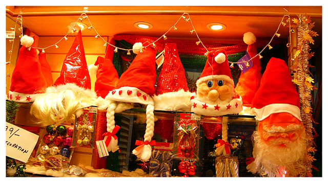
There's a considerable charm to this image. The contrast between the pop-eyed santa and the grumpy santa is especially amusing. Nevertheless, nothing in the image elevates it beyond the "snapshot" stage for me, or apparently for the voters. Before addressing this picture individually, I'd comment in passing that your "best" shot might have been to zero in on the 2 santas and play them off against each other for comic effect.
That said, there are a couple things working against this particular image. Most obvious is the extreme yellow cast of the lighting; you almost certainhly used daylight white balance, and tungsten white balance was called for here: daylight is MUCH more blue than tungsten light. (Tungsten light, in case you don't know, is what ordinary lightbulbs throw; also called incandescent light, it is derived by heating a tungsten filament so radically that it glows, and it's VERY warm light) In any case, you can (and should) use any image editing programs color blance controls to neutralize the whites here. Thast would help a lot.
Another problem witht he image is the noticeably skewed "architectural" elements. You fixated on the horizontal molding at top and rotated camera so that was true horizontal, but in so doing you threw the verticals way off, and also further skewed the less-visible horizontal elements at the bottom of the scene. Optimally, the camera would be vertically squarted up for this shot and the the horizontal lines would be true horizontal only in center of image, with upper ones slanting down and across from upper right, and lower ones up and across from lower right.
Or, better yet, you could move the camera POV more to the left so the entire image were more in elevation instead of zooming off to a left-placed vanishing point. This would mean removing the handwritten sighn, but this should have been done anyway ont he image as we see it now, as it's another distracting aspect of the shot.
Finally, it looks to me as if there's a bunch more interesting stuff lopped off at the bottom, and a lot of what's on the top is pretty much wasted image space. I can see why you cropped the way you did, wanting to see the entire loop of the bell-chains (or whatever they are), and I respect that, but it might work better if we had more of the interesting stuff in foreground.
Still, like I say, I think your "shot" might be to focus in on the 2 faces, not go for the overall picture...
Happy New year!
Robt.
|