| Author | Thread |
Comments Made During the Challenge  |
|
|
03/02/2003 04:30:45 PM |
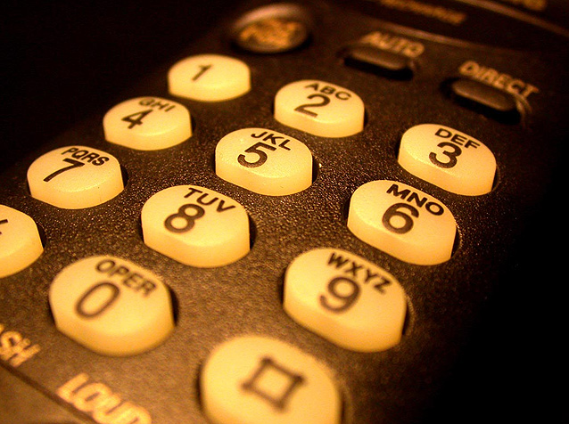
| having just the bottom row of buttons out of focus seems distracting to me. My eyes are drawn to the # key and the 0 just because they don't flow with the rest of the shot. Otherwise I like the shot. I even like that the non-digits buttons are blurred.. just a little more depth of field would help though. |
|
|
|
03/02/2003 10:46:42 AM |
| Bland but with strong technique. It would work for stock photography I think. However, there seems to be an icky yellow colour cast that doesn't appeal to me. |
|
|
|
02/27/2003 07:33:31 PM |
| This is a great macro of the 5,3 and 7 buttons. I guess you already knew that. I don't know the significance of the number, but to those that do I hope you sell a million or so prints. 5 |
|
|
|
02/26/2003 08:35:40 AM |
| I think this would make a very good stock photo. The composition and DOF are both very good. |
|
|
|
02/25/2003 10:31:57 AM |
| The use of narrow DOF adds great interest to this shot. |
|
|
|
02/25/2003 09:55:37 AM |
| Good stock photo with a nice shallow DOF, which is common in such photos. I myself wouldn't have cropped it so tightly, although that doesn't lower the quality of the image at all. |
|
|
|
02/24/2003 08:43:13 PM |
| Nice composition. I think I would like it better with more DOF so that all keys are in focus. Good lighting and exposure. |
|
|
|
02/24/2003 02:02:48 PM |
| I believe that the yellow tint on the phone keys may hurt the overall impact of this image... maybe a little white balance adjustment in the camera would make this shot much stronger :) - setzler |
|
|
|
02/24/2003 11:48:43 AM |
| Why sepia? Sepia implies old fashioned to me. This phone still looks modern to me. |
|
Home -
Challenges -
Community -
League -
Photos -
Cameras -
Lenses -
Learn -
Help -
Terms of Use -
Privacy -
Top ^
DPChallenge, and website content and design, Copyright © 2001-2025 Challenging Technologies, LLC.
All digital photo copyrights belong to the photographers and may not be used without permission.
Current Server Time: 03/12/2025 02:23:56 PM EDT.