| Author | Thread |
|
|
01/03/2005 12:23:37 AM |
this is one of the most underrated entries in the challenge :(
great shot! keep it up. what's important here is the number of comments and the score of the commenters. you are definitely on the right track. more than likely, it was the 'darkness' of the image that held down your score. better luck next time! |
|
 Photographer found comment helpful. Photographer found comment helpful. |
Comments Made During the Challenge  |
|
|
01/02/2005 04:03:21 PM |
|
|
|
01/02/2005 02:29:57 PM |
| I think this misses the point of the challenge...unless I'm missing a "hidden face"? |
|
|
|
01/02/2005 05:50:05 AM |
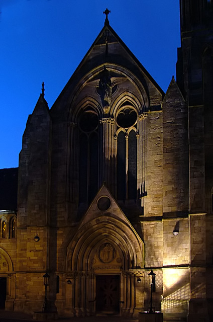
Really nice shot.
The 'bad' lighting really helps pick out the face.
Wish people would think about lighting buildings properly.
Great clear sky
Good luck
8 |
|
| Photographer found comment helpful. |
|
|
12/31/2004 05:08:33 PM |
| Nice job. Tough lighting. |
|
| Photographer found comment helpful. |
|
|
12/31/2004 02:24:57 PM |
| Devilish! Wonderful portrait with a gothic theme. |
|
| Photographer found comment helpful. |
|
|
12/31/2004 02:44:16 AM |
| Would work a lot better if you could coax some detail out of the second "eye"... |
|
| Photographer found comment helpful. |
|
|
12/31/2004 02:13:29 AM |
| A face, all right. Well seen. God??? Interesting choice of names. Bet it gets some comments. |
|
| Photographer found comment helpful. |
|
|
12/30/2004 03:23:50 PM |
| God is certainly not very happy. I like your different approach. |
|
| Photographer found comment helpful. |
|
|
12/29/2004 04:50:25 PM |
| god looks like he is not too happy with us |
|
| Photographer found comment helpful. |
|
|
12/29/2004 03:07:07 PM |
| Nice. It's a shame that so much of the facade is in shadow, but I'm not sure how you would have avoided that. |
|
| Photographer found comment helpful. |
|
|
12/28/2004 10:02:24 PM |
| This is one of my top three for this challenge. Beautiful architecture. A few spots in the upper left corner you might clean up. Great shot! |
|
| Photographer found comment helpful. |
|
|
12/28/2004 08:01:59 PM |
| Excellent lighting and shadows, and the sky seems vibrant. Can't decide whether I would have cropped the lower third off to get rid of the light and grid shadow. I guess I'd have to try and see if it made a significant difference. |
|
| Photographer found comment helpful. |
|
|
12/28/2004 07:30:32 AM |
| what a powerful entry! easily a top-10. great job! |
|
| Photographer found comment helpful. |
|
|
12/27/2004 06:01:09 PM |
|
| Photographer found comment helpful. |
|
|
12/27/2004 10:35:55 AM |
| No wonder kids don't like going to church, look how scary it looks! Very pretty, just ominous. Great lighting, obviously fits the challenge, 9. |
|
| Photographer found comment helpful. |
|
|
12/27/2004 05:58:44 AM |
|
| Photographer found comment helpful. |
|
|
12/27/2004 04:12:49 AM |
| This is a great spot. Really nice. For me, I would have liked to see more of the 'eye' on the left, it is a little too much in the shade. |
|
| Photographer found comment helpful. |
Home -
Challenges -
Community -
League -
Photos -
Cameras -
Lenses -
Learn -
Help -
Terms of Use -
Privacy -
Top ^
DPChallenge, and website content and design, Copyright © 2001-2025 Challenging Technologies, LLC.
All digital photo copyrights belong to the photographers and may not be used without permission.
Current Server Time: 03/16/2025 01:51:38 AM EDT.