Troy
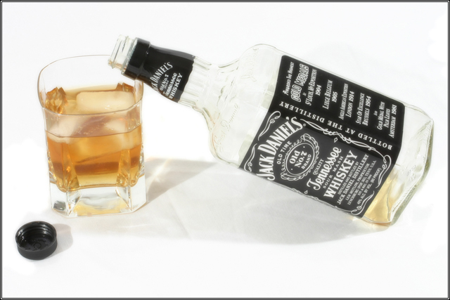
You've done a nice job with the ambient lighting: it defines shape nicely, without overt glase.
For me, though, the composition is a bit static. Depth could have added by angling the bottom of the bottle away from the camera, and revealing the open mouth of the bottle slightly, to match the circle of the glass and the cap. The position of the cap in the composition pulls the eye away from the central image, as there' a lot of contrast between the cap and the surface.
I'd like to see the glass stand out as a subject: backlight focussed into the whiskey would have made the liquid glow and draw the eye to it, making the glass the subject. The whiskey looks a bit muddy and less desirable as is.
Contrast: I think the black of the labels could be a bit deeper. That would help the gold of the whiskey stand out. I'd also like to see a bit textural contrast; perhaps a textured cloth or tablecloth under the glass and bottle.
Furthermore, if this is meant as an ad shot, some 'elegant' props to make this appear a high-class setting would help sell the product.
As is, I think the entire setting is a bit bland.
Hope I've given you something to think about. |