| Author | Thread |
|
|
01/09/2005 02:39:39 AM |
*** CRITIQUE CLUB COMMENT ***
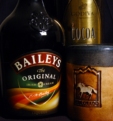
Rich tonalities are attractive. Composition is a little static to be truly engrossing, split as it is into such a nearly symmetrical opposition of halves. Image suffers from blocking up in the shadows; more care with the lighting would have given richer dark areas and more wow factor. The s-curve upper left is attractive, but I keep wanting to read it as the shoulder of the bottle and it seems at odds with the hilit right shoulder of the same bottle. Falloff of light on the word "Baileys" is a little offputting to me, as is the asymmetrical distortion of the arch of this label.
Robt.
And, Swagman my friend, this was a random draw :-) |
|
Comments Made During the Challenge  |
|
|
01/07/2005 09:25:03 AM |
| Now there's a resolution you might keep :?) (7) |
|
 Photographer found comment helpful. Photographer found comment helpful. |
|
|
01/02/2005 03:44:56 PM |
| Now there's a resolution to stick with. Like the composition and color, that light in the Baileys bottle is bothersome though. Good luck and HNY. |
|
| Photographer found comment helpful. |
|
|
01/02/2005 02:50:47 AM |
| This one made me smile :) |
|
| Photographer found comment helpful. |
Home -
Challenges -
Community -
League -
Photos -
Cameras -
Lenses -
Learn -
Help -
Terms of Use -
Privacy -
Top ^
DPChallenge, and website content and design, Copyright © 2001-2025 Challenging Technologies, LLC.
All digital photo copyrights belong to the photographers and may not be used without permission.
Current Server Time: 03/12/2025 07:56:56 AM EDT.